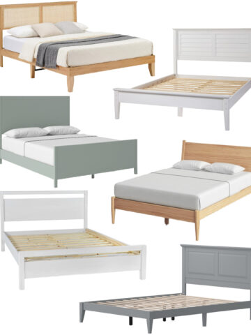
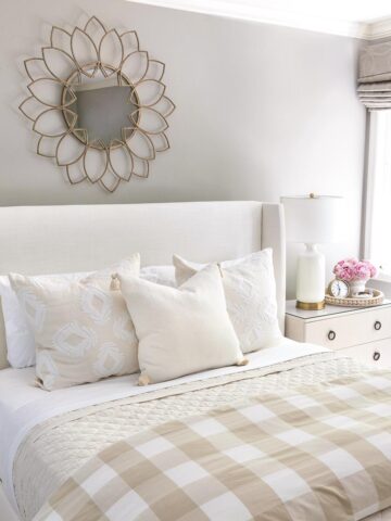
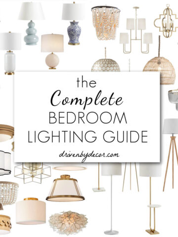
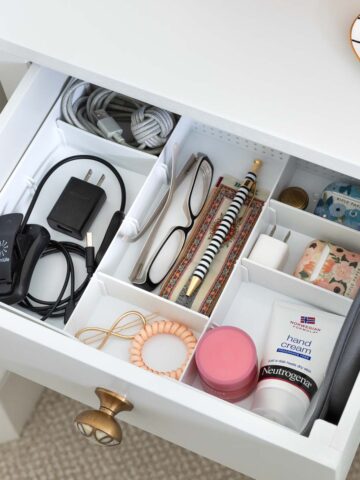
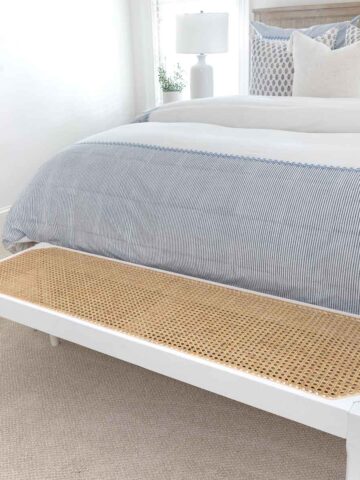
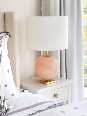
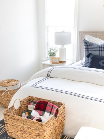
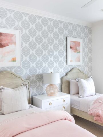
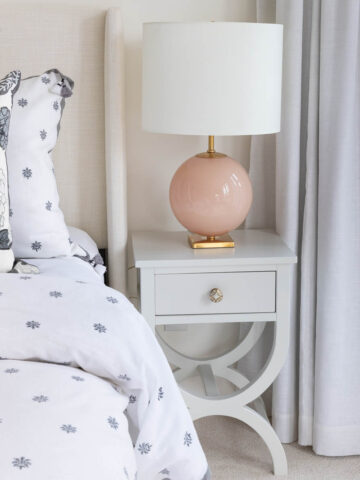
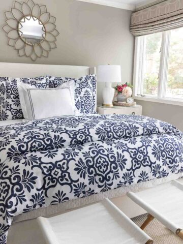
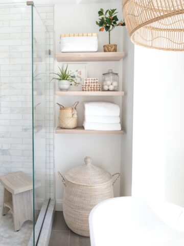
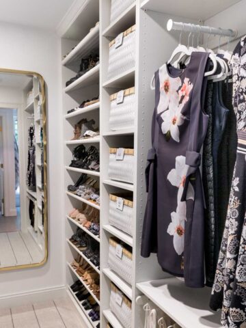
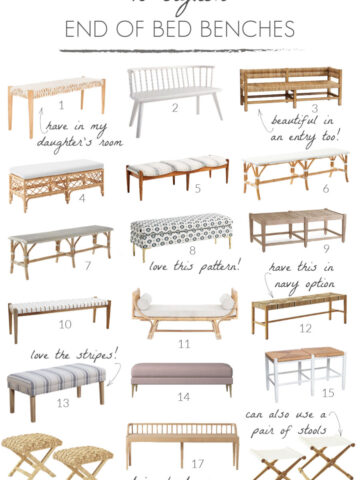
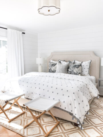
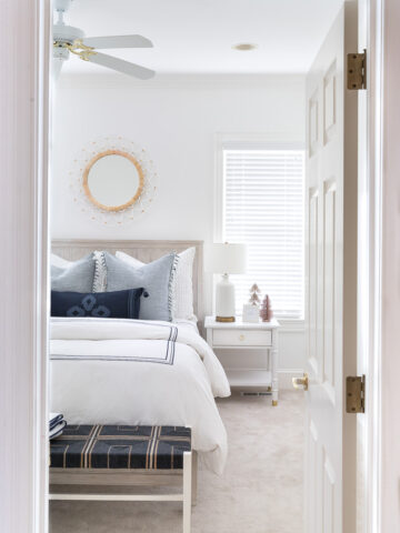
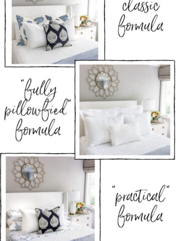
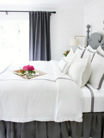
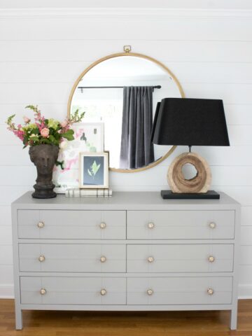
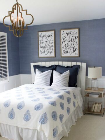
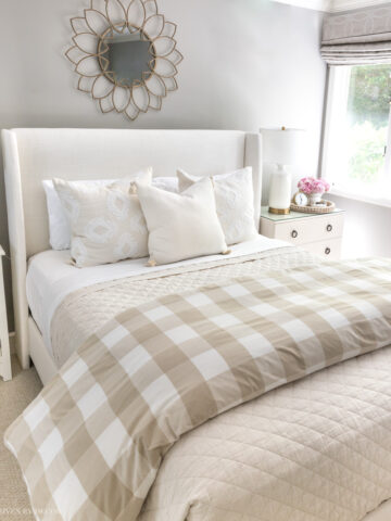
The tour of our previous home continues with the guest bedroom and bath! I went back and forth about whether to include this room in the house tour because it has a longer “to do” list than “done” list but we’ll take a look around anyway! (post includes affiliate links – see my full disclosure statement {here})
My favorite thing about this room is the wall color – Benjamin Moore’s Kentucky Haze (AC-16). It is a soft, sophisticated greenish blue. You didn’t think I painted with anything but neutrals, did you? 🙂
The upholstered headboard came from the Pottery Barn Outlet:
Those of you who have had your morning coffee might have noticed that there’s a burlap bow tied on the side of it:
That’s because it’s hiding this patch:
The poor thing had been sent to the PB Outlet because of a small tear but I couldn’t pass up her $125 price tag so the patch and burlap bow were my way to pretty her up.
The upstairs of our home gets much warmer than the downstairs in the summer so bedroom ceiling fans are a must. The guest room fan recently broke so I replaced it with this one – the Minka Aire Strata in smoked iron:
It’s one of the fans that I found when I was searching for a ceiling fan for our home office. My other favorite ceiling fans can be found {here}. We haven’t done much else with the room other than changing out the closet doors (they were previously louvered):
and replacing the closet knobs (as well as all of the other builder’s grade door knobs throughout the house) with Baldwin classic levers in venetian bronze:
to this:
The mini facelift included a change in wall color ( to Behr’s Understated BNC-02), painting the storage cabinet with Annie Sloan chalk paint, and adding two framed prints!
Congratulations for the wonderful work! have a nice week. I’ll wait for the relook of the dresser.
Thanks Helena! Hopefully I’ll get to that dresser sometime soon!
Kris- looks great! Love the headboard — it totally softens the room! Can’t wait to see more!
Thanks Stephanie – the headboard is definitely a keeper but the rest of the room needs some work! I’m planning to totally change it up in our new house!
Kris, this is beautiful! It looks almost finished to me. I love how you covered the tear…I would have bought that in a heart beat! Great Job.
You’re the sweetest, Linda – thanks!
So pretty! What a steal on the headboard!
Thank you Becky. Gotta love PB Outlet!!
Hi! Such a great blog – your home is awesome! 🙂 I blog over at Design Your Dwelling. I would love to have you stop by. Today I’m hosting a mood board link party for interior design bloggers so if you have a mood board come on over and link up – or connect with other interior design bloggers!
Looking forward to following… BETH
I will check it out – thanks Beth!
How would you describe Behr’s understated color? I’m thinking about it for my kitchen and painting over a yellowish/cream like it appears you did. Grey/Beige, Yellow/Beige, Pink/Beige, Brown/Beige? Or am I way off – I’m only looking at a 1 inch sample card. Did you find it brightened or darkened the room? Thanks!
Hi Michelle, this was in our old house and it’s been over three years since we lived there so I honestly don’t remember what color undertones it had – it was in our guest bathroom so I was hardly ever in there. I did like it though – it was just a good solid midtone neutral that darkened the room from the yellow that was there but in a good way – it was a more calming feel.