The words “boring neutrals” totally make me cringe. Neutral home decor can be incredibly soothing, warm, and welcoming and, when done right, anything but boring. Today I’m sharing my tried and true tips for decorating with neutral home decor that will make your neutrals-filled room every bit as interesting as one that’s full of color. (post includes affiliate links; full disclosure statement available {here})
Mix In Some Patterns
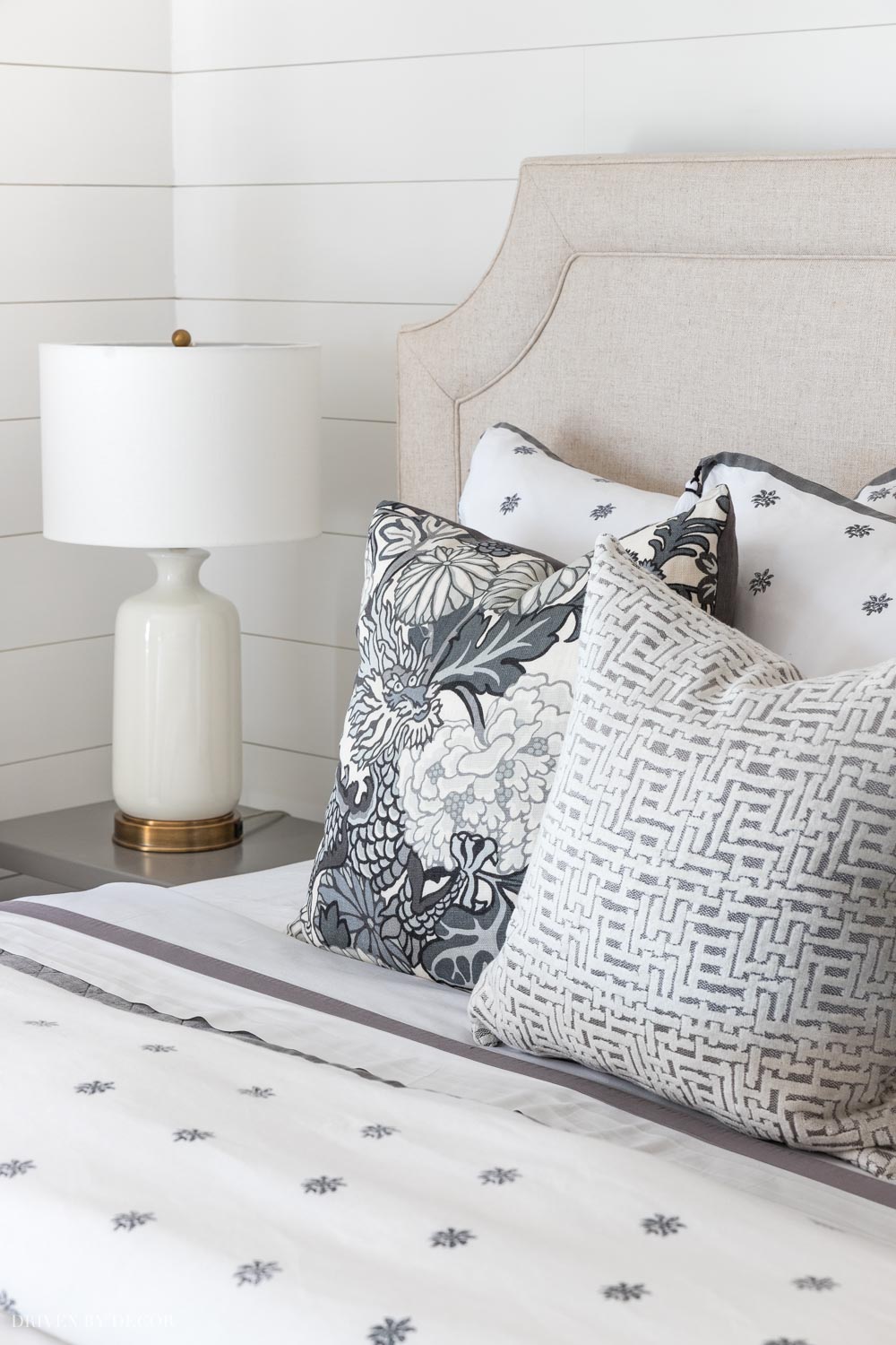
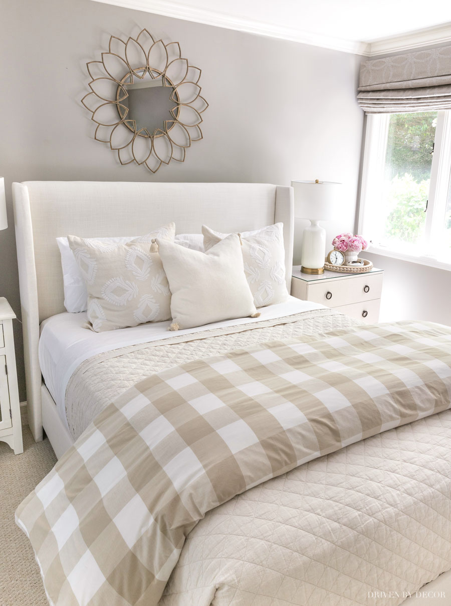
A room full of solid neutrals tends to feel a bit bleh but mixing in a few patterns will immediately add interest. For example, all of the pillows in our bedroom are neutral colors, but the mix of geometric and patterned prints keep it interesting:
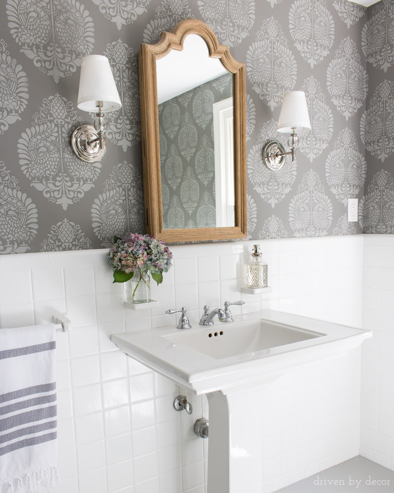
Patterns also don’t need to be limited to fabric – instead of solid colored walls, adding pattern with wallpaper or a stencil like I did in our budget bathroom remodel is something to think about:
Load Up on Texture
Every room with a neutral home decor needs some interesting textures – nubby fabrics, plush throw rugs, and woven baskets are a few of my favorite textural elements. For our master bathroom remodel, I added {this lidded basket} to use as a hamper and {this small basket} to hold washcloths – they both add a lot to this space that’s full of hard surfaces:
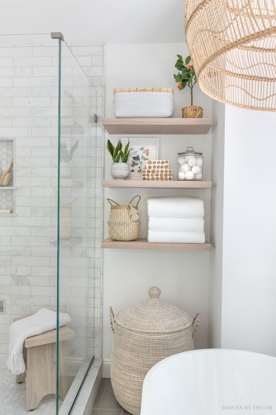
You can get all of the sources for everything in our master bathroom remodel {here}.
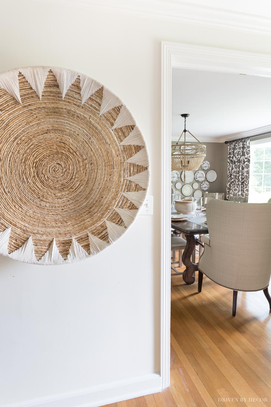
In our hallway, I have {this large basket} hung as art which is another way to add warmth to a space:
Add a Little Color (If It Needs It)
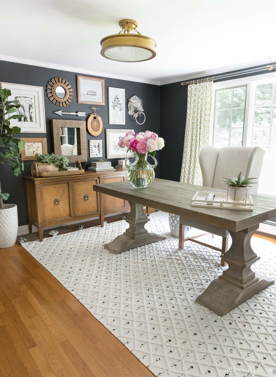
I don’t think that every room needs color but I do think that some rooms benefit from at least a small dose of it. Our home office is full of neutral home decor (furniture, art, walls, etc.) so when choosing fabric for drapes, I chose something with a little pop of color (citrine yellow!) to liven it up:
Want to save this post?
Notice that I added a highly textured rug in here too!
Choose a Paint Color with Depth (If You’re Not Using a White)
This tip might just be a personal bias of mine but I feel like there’s nothing that makes a room feel more boring than a dull shade of builder’s beige paint on the walls. My preference is to use a shade of white on the walls or go with a paint color that has some depth to it like the Pratt & Lambert Ever Classic paint color in our guest room that has such a rich feel:
You can check out my favorite white paint colors {here} and my favorite greige paint colors {here}.
Add Layers, Layers, & More Layers
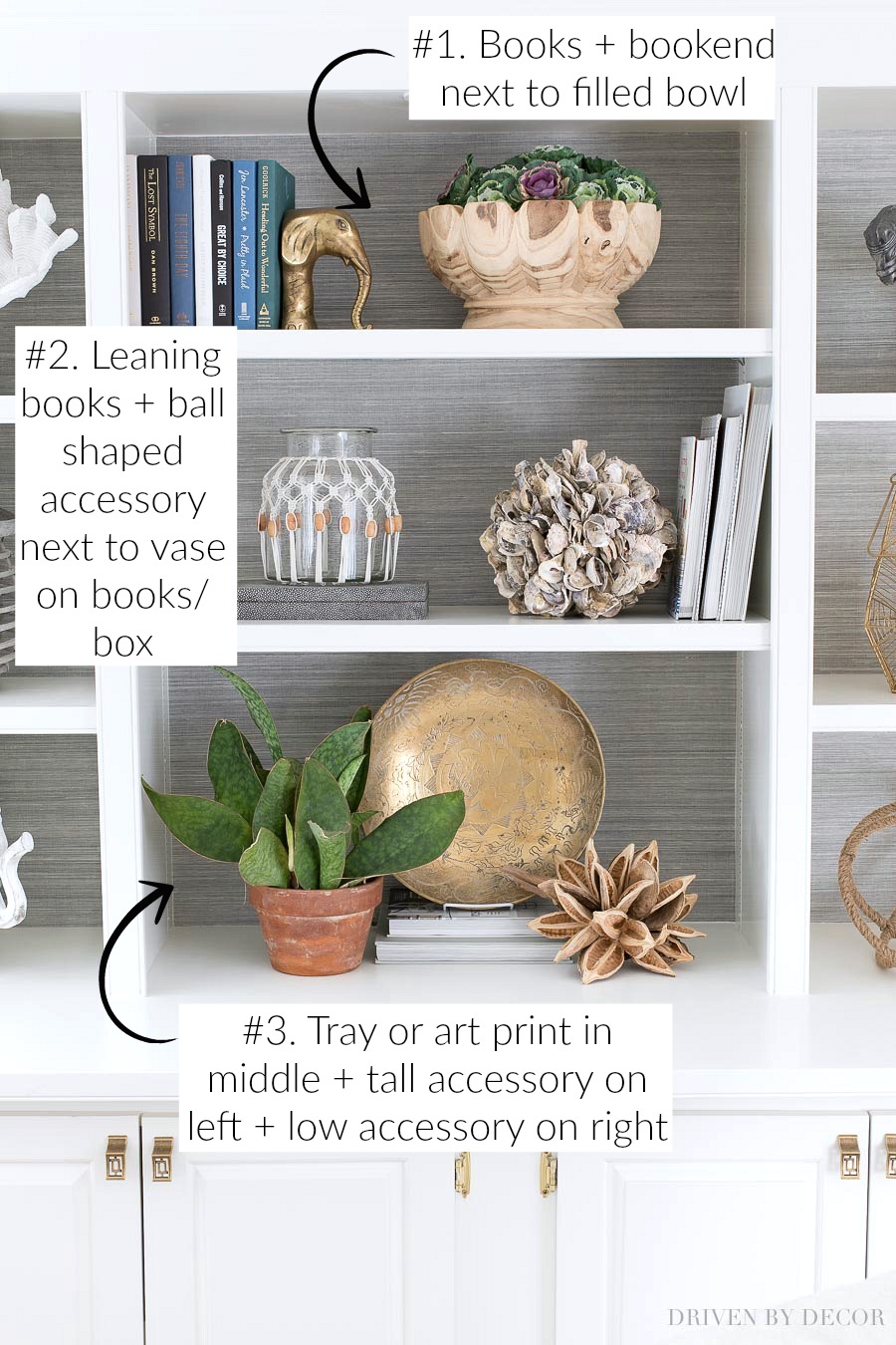
Layering is key! Layering texture upon texture, tone on tone, and even physically layering art and accessories creates interest! For example, tip #3 from my post on how to decorate a bookshelf shows how layering in a few neutral home decor pieces makes it look so much more interesting:
Add Warmth with Natural Woods
Natural wood pieces bring warmth and depth to neutral home decor! Almost every room in our home has a wood toned piece whether it be something small like the wood lamps in our guest room or larger pieces like the wood credenza in our office or {this natural wood table} in our kitchen eat-in space:
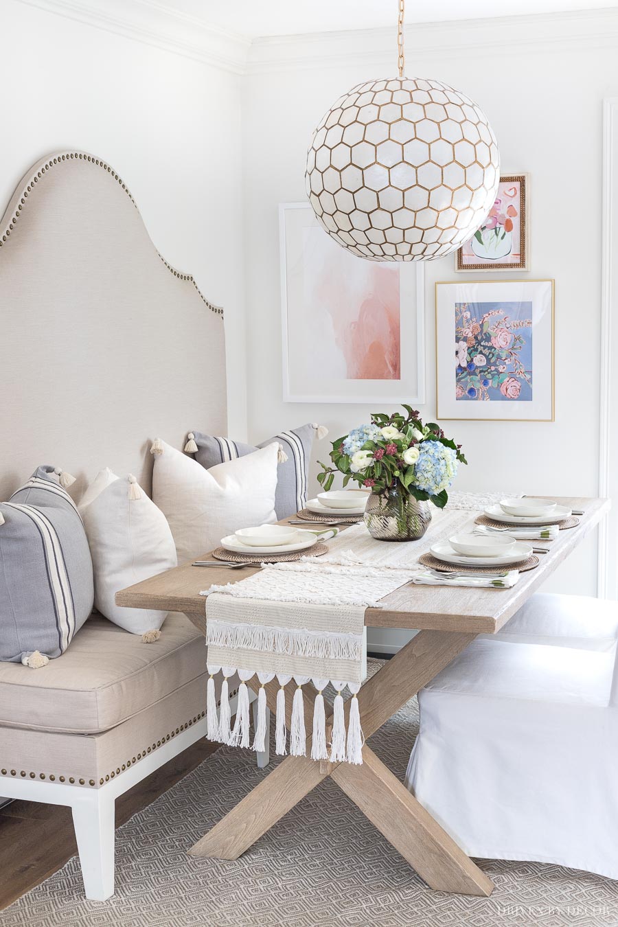
Get all sources for our kitchen eat-in and see more pics of this space {here}.
So that wraps up the tips that have worked for me when decorating with neutral home decor. Do you guys have any other tips or tricks of your own to add?
XOXO,


Debbie says
Wonder site. Getting older, I’ve discovered this is the design that appeals to me. A very classy, yet simple sophisticated design decor. I love it. thanks for all your tips – you have inspired me.
Kris Jarrett says
Debbie you’re so sweet to take the time to leave a comment – thank you so much!
Hailey says
I like every idea! Working with neutrals can be tricky. I usually love the patterns to break the uniform look.
Angela says
I love your sense of style! Question about the desk in your home office. I’m looking for something similar and want to use your room as my inspiration picture. Is it a small dining table or an actual desk? It’s kind of hard to tell the size in the pic. ????
Kris Jarrett says
Hi Angela! Our home office desk is actually our old dining room table (we bought it from World Market 10+ years ago). It measures 45″ x 63″ – hope that helps!
Kelley Nan says
You do neutrals RIGHT, Kris! Love all your tips!
Shelley @ Calypso in the Country says
So many beautiful tips, Kris! I always love the way you layer items. You always make it look so easy! And I still get impressed every time I see your amazing bathroom! Yes, summer is flying by, isn’t it?
Shelley
Garden, Home and Party says
Kris,
I loved your tips. Your home is anything but boring. It was nice to read some of the ideas you have to making sure that doesn’t happen to our homes! 🙂
xo,
Karen
Design Chic says
So many great tips, Kris. Like you, we love decorating with neutrals for the calm feeling in each space. Adore every room in your home!!
Barbara Herbert says
Beautiful home, thanks so much for all your tips.
Kris Jarrett says
Thank you so much Barbara!
Anne says
Peaceful and pretty-thanks for the inspiration!!
Kris Jarrett says
Thank you Anne!
Kelsie says
I LOVE neutrals in decorating – I feel like it makes it so much easier when it comes time to add some seasonal touches! Nothing clashes, and the seasonal touches add little pops of color. LOVE your home. <3 So gorgeous!
Kris Jarrett says
I agree Kelsie – neutrals just give you so much freedom to change things up without spending a lot of money!