Deciding between Sherwin Williams Repose Gray vs. Agreeable Gray? I’m sharing the differences between these two paint colors to help you decide which is best for your space!
I’ve been wanting to paint our foyer for a while now after finishing up removing all of the wallpaper back in September (remember that little piece of hell?!). I even bought a bunch of samples but hadn’t gotten around to putting them up on the wall. Well, I finally got back on the paint-the-foyer train so this weekend I painted my samples on a wall in our foyer and I’ve narrowed my choices down to two – it’s Sherwin Williams Repose Gray vs. Agreeable Gray:
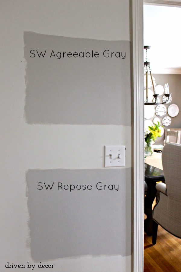
Here are the differences I noted in looking at Repose Gray vs. Agreeable Gray:
1. Repose Gray is slightly darker than Agreeable Gray. Repose Gray has a LRV (Light Reflectance Value) of 58 and Agreeable Gray has a LRV of 60 (the lower the LRV, the darker the paint color will look and feel once up on the wall)
Want to save this post?
2. Repose Gray has more gray in it while Agreeable Gray has more beige in it. Repose Gray can also take on a green tinge in some spaces.
I’m leaning towards Agreeable Gray. What do you think?
To see examples of both paint colors in rooms and see how these two colors compare to other greige paint colors, be sure to visit {this post} on my ten favorite greige paint colors!
I’ll definitely share pictures once I’m done so stay tuned…


Albert Fox says
I chose Agreeable Gray for the kitchen cabinets in semi-gloss and they read as a medium warm gray. Everyone said it was a light gray, but it isn’t. I had to repaint the walls around it high reflective white to pop the color because classic gray not only blended in too much, but the two colors seemed off. For the kitchen island backside, knockdown walls), I darkened it 150% and it took on a very pleasant mushroom color. It’s become my favorite (patch of) color in the whole house! I lightened agreeable gray 75% in the guest bathroom and it came out the most perfect tinted gray I could imagine. I’m debating about using this same shade in the primary bath or lightening it up to 50% strength! Please post the final product!
Kelli says
I just randomly found your page while searching for paint colors and I love it! This article was very helpful. I was leaning toward repose gray, but I thought I saw a tinge of green in it, too. My floors cause a tinge of *anything* to tint the entire room, so agreeable gray it is!
Anita says
I really need sone help today. I’m soooo torn between agreeable gray and repose gray.
My couches are dark brown leather and I gave beautiful tile with gray, beige, cream in it.
I love color so I have a viral accent wall with white large shutters going into the cigar room
My is over cones tomorrow and I need to have my color ready.
Musafir says
I painted my master bedroom and attached open bathroom (north/south facing) repose grey. It has definitely a green understone. Yet in my powder room and laundry room with no natural light, it looks more grey or rather has a blue undertone. Now, I’m debating if I should go with Agreaable or Repose for the rest of the walls-hallways, dinining and living rooms. I want to avoid the green undertone. I don’t like beige but I’m leaning toward Agreeable, hoping it will be more neutral.
Susanne Wik says
Our builder painted the walls in most of the house SW Repose Gray. It’s lovely and doesn’t turn pink at all. The house has dark wood floors with a white trim. The color is very relaxing.
Roberta says
what is the best color flooring for 8×6 bathroom in basement, agreeable gray walls ?
Dawn Nicole Woolner says
Hi, all of you that went with Agreeable Gray, what color trim and ceiling did you go with? I’m having a heck of a time choosing.
Bernadette Telander says
Which of those two grays ~ Repose or Agreeable ~ would go better with mahogany wood trim?
Jackie says
I am in the same boat – need to decide between Agreeable Gray or Repose Gray for an entire repaint of my first floor. Plan on taking the color throughout, with the exception of the office (Oyster Bay) and bathrooms (Anew Gray) on the first floor. I’m leaning hard toward Agreeable Gray, but have concerns about the lighting in my home. The kitchen/dining area, living room and master bedroom are all NW exposure. I picked up sample quarts of the two colors and painted 8×10 canvases – but I really feel like I won’t know how AG is going to behave until the paint is on the walls. Makes me nervous because I am paying a contractor to do this job, and I won’t be able to afford a do-over.
I see from the comments that you ended up going with white instead. What color did you choose? I’m toying with the idea of using Alabaster in my kitchen area to make it brighter/warmer (natural Alder cabinets, black granite, and neutral light beige ceramic backsplash) – I feel like it would be a good choice to be adjacent to the living room with AG.
I’ve been trying to make this decision for most of the summer, and now I’m down to the last 48 hours before I need to give the contractor my color choices. I’m sure I will be second guessing my decision right down to the last minute.
Kelli says
I feel your dilemma in my soul lol. What did you choose?
Annie says
I much prefer the cooler greys, so Repose Gray appeals, but my kitchen cabinets, 3 bathroom vanities and the wood around the fireplace are cherrywood (reddish gold), with light gold/beige tiles or gold light hardwood. Black granite in the kitchen, with greenish gold slate backspash, no window, so dark. I can’t afford to change the backsplash or countertop, is Agreeble Gray a better choice? Kitchen and living room walls are now green, which I don’t like. Bathrooms have warm white with light grey quartz countertops, and walls are creamy yellow, which works with all the gold-beige tiles, but I really want to “cool down” the overall look so am hoping I can do it with the right paint. Thanks!
Patti says
Hi, Thanks, I’ve been torn between the same two grays and also chose Agreeable
. My house is a typical 70’s ranch and the bathrooms both have the original ceramic tile so it’s complicating choices! The one bathroom will have to be white because there is so much already going on there. My question is which white are you using for trim? I’m torn between Alabaster and Pure white. I’d like to do the trim and ceilings in the hall and bedroom and the small master bath in white. Also should I use satin for trim and eggshell for ceilings? Thanks! Patti
Judith Z says
Repose Gray will pick up the wood tones in the mirror. Agreeble Gray has a tad too much beige.
Aggie says
Hello, what’s the paint color of your dining room wall? It looks like a darker shade of Agreeable Gray.
Thanks!
Debra says
I painted my interior in repose gray and it was beautiful
Kris Jarrett says
Thanks for sharing Debra!
Tracy says
Both colors are tricky. Lighting, floor and textures can turn pink and or blue tone. Personally I’m a fan of soft whites. Especially if home has lower sun light. Good luck
Dianne says
Agreeable gray for sure. Sometimes Repose Gray gets a slight violet/purple look depending upon the lighting.