On the hunt for a great greige paint color? After surveying thousands of readers, I’m sharing the top ten reader favorites to help you make the perfect choice for your own home!
When I was on a mission to lighten up the look and feel of our living room, I went on the hunt for the perfect greige paint color to freshen up our space. Luckily for me, I have this huge group of home decor lovers (you guys!) who were willing to share your go-to greige paint colors! I asked for your favorites on Instagram and Instagram Stories and compiled the thousands of responses to come up with the ten best greige paint colors. These are the go-to’s that so many of you have used, love, and would recommend to others. (post includes commissionable links; for more information, see my full disclosure statement {here})
Sampling Greige Paint Colors
Before delving into these ten favorite greige paint colors, I wanted to give a few words of caution – the same paint color in your home won’t necessarily look exactly like it does in someone else’s home. I absolutely recommend getting peel and stick paint samples of your final contenders so you can see how each one looks in the room that you’ll be painting. See my post on how to choose paint colors for more details & tips.
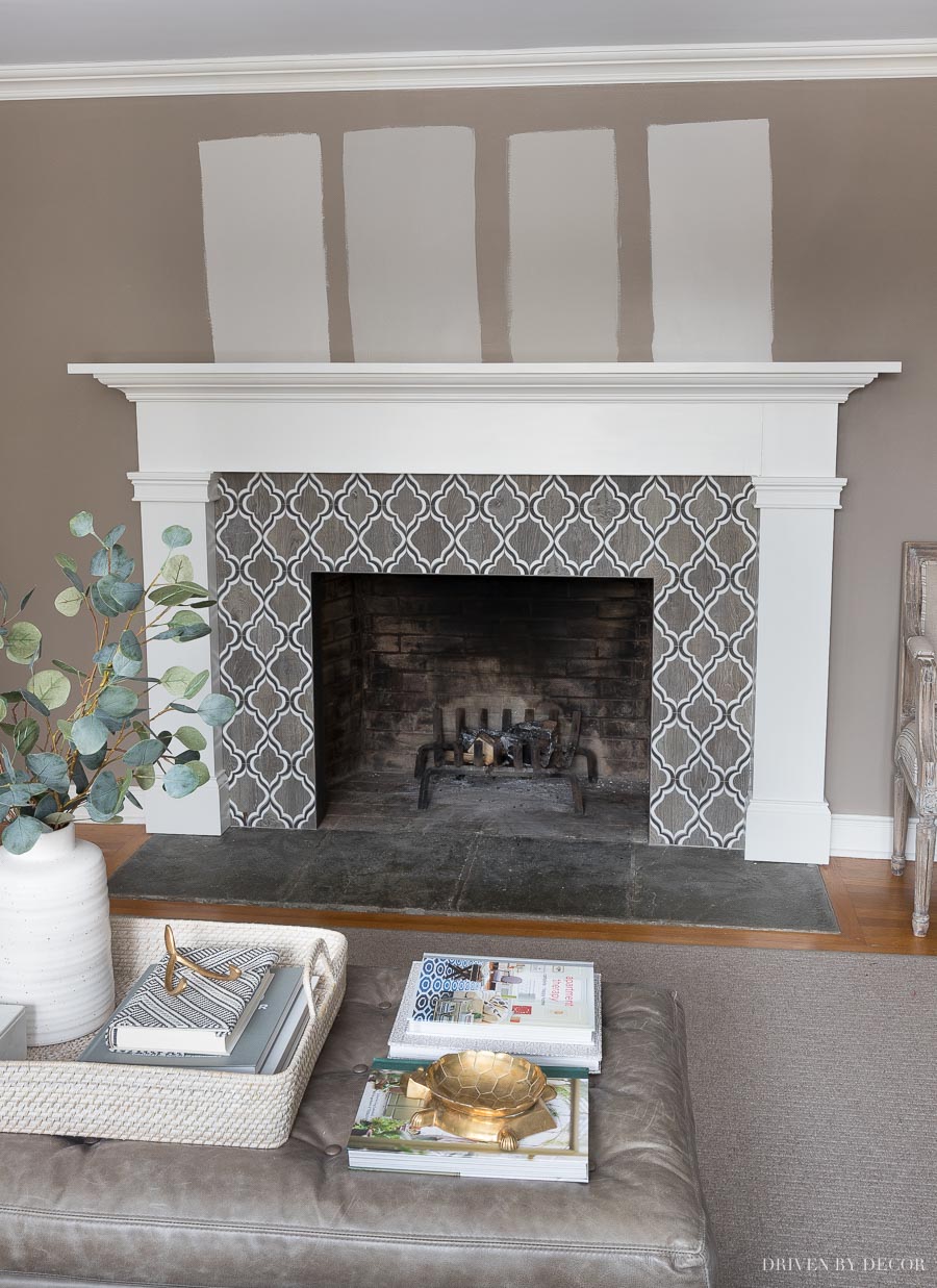
Usually I narrow it down to 3-4 favorite paint colors to sample, but for this post I put nine of the ten favorites up (all but the lightest greige) so I could share them with you! It’s pretty crazy how ten colors that are all greiges are actually so very different from each other (FYI I realize this image looks a little shadowy but I kept it this way because I think it represents the true colors much better than if I brightened it):
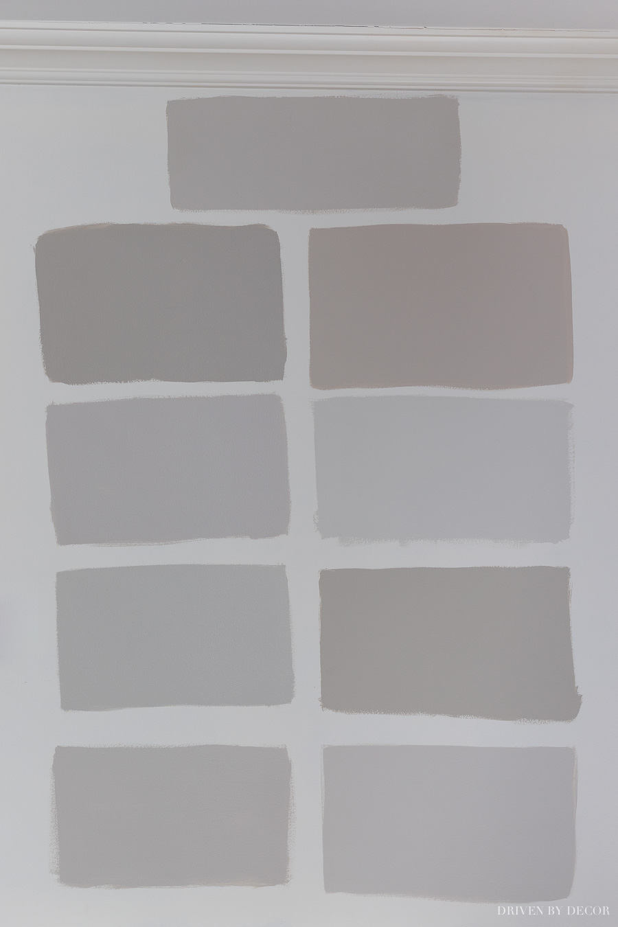
I’ll go through each color one by one but so you can reference back to my samples above, here are the details on which color is which:
Top Middle: Worldly Gray
Left Column (from top to bottom): Anew Gray, Alpaca, Repose Gray, Agreeable Gray
Right Column (from top to bottom): Wheat Bread, Silver Drop, Revere Pewter, Balboa Mist
I’m sharing them in order from darkest to lightest, using each paint color’s LRV (Light Reflectance Value) as my guide. The lower the LRV, the darker the paint color will look and feel once up on the wall. My current living room paint color, a tweaked version of Sherwin Williams Keystone Gray, has an LRV of 29 so even the darkest of these ten will really lighten things up!
1. Sherwin Williams Anew Gray (7030) LRV:47
I’m a huge fan of Anew Gray which is a very warm, midtone greige that has the most depth of the greiges on this list. If you’re looking for a greige that’s rich in color without being too dark, this might be the one for you. And in my finicky space where weird undertones tend to come out with a lot of greiges, the Anew Gray sample that I put on the wall threw no surprises.
A gorgeous example of Anew Gray is {this beautiful farmhouse chic bathroom} by Mandy of Country Dog Homes:
You can see more of Mandy’s Nashville fixer upper by following her on Instagram at @country_dog_homes {here}.

Spoiler Alert! After sampling all of the greige paint colors in this post, I went with Anew Gray for my space:
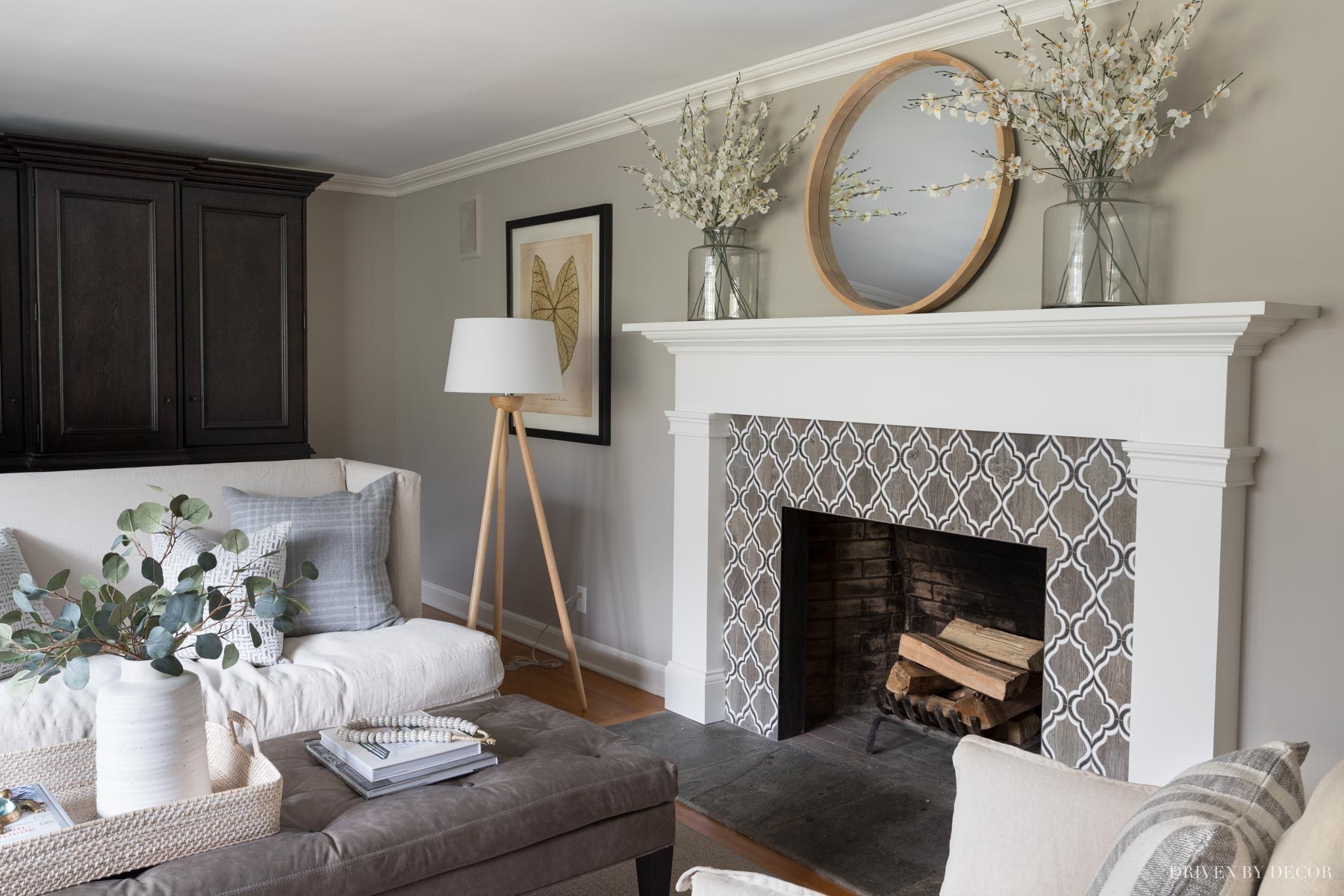
Sources: Loveseat & ottoman (custom order from Lee Industries) | Linen swivel chairs | Wood floor lamp | Framed leaf art print | Woven ottoman tray | White vase | Faux eucalyptus | Bone beads | Black & white striped pillows | Round mirror over fireplace | Vases on mantel – no longer available | Faux flowers in mantel vases
See more pics and get tons of details in my full post on Sherwin Williams Anew Gray.
2. Behr Wheat Bread (720C-3) LRV: 55
Behr Wheat Bread was one of the new-to-me greige paint colors that many of you have used and rave about! It doesn’t surprise me that it has the same LRV as Revere Pewter because these two colors are almost identical in color intensity but Behr Wheat Bread definitely leans a lot more toward the beige side than Revere Pewter. I love it in this beautiful shabby chic home office makeover by Sarah Melito:
You can check out the rest of Sarah Melito’s home and follow her on Instagram {here}
Tip: Save a ton of money by learning how to do your own painting! See my post on how to paint a room for step by step painting tips.
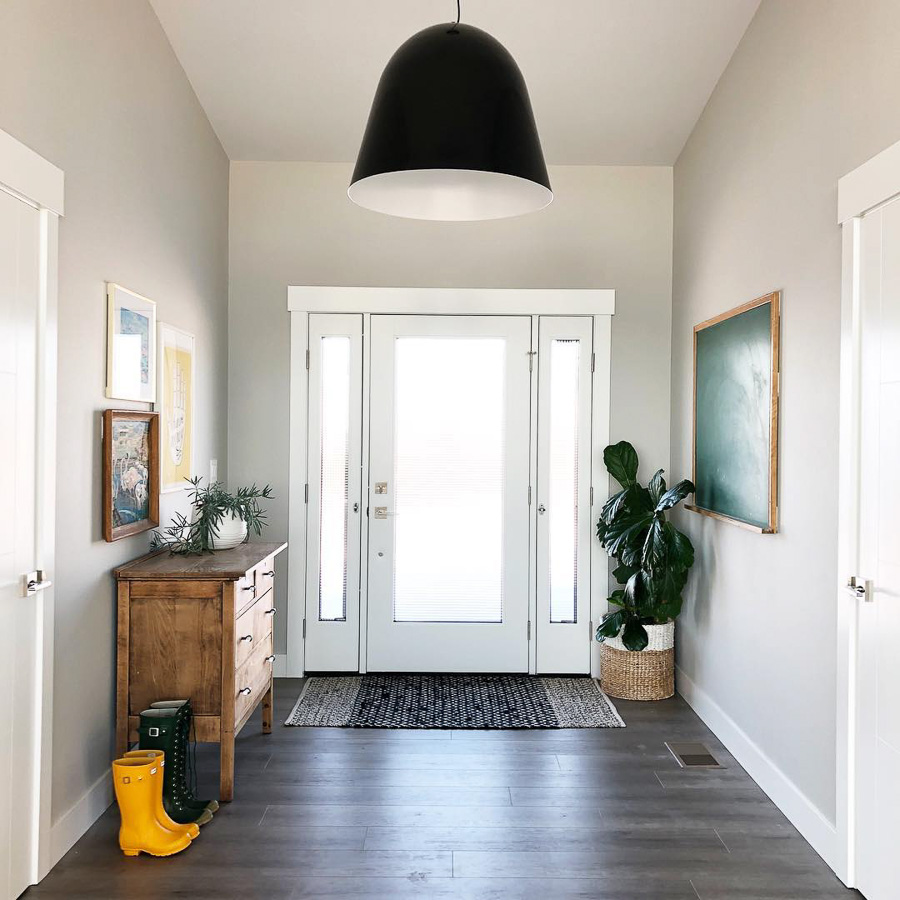
3. Benjamin Moore Revere Pewter (HC-172) LRV: 55.05
Revere Pewter was voted the #1 best greige paint color among readers and is a favorite of mine too. There’s no one paint color that’s a “no fail” color but Revere Pewter is as close as it gets, looking great in almost any space. A few years back when my sister called me in a panic that her painter was there and she didn’t like how things were looking with the paint color she chose for her living room, Revere Pewter is the color I recommended she try since she had to chose something else on the spot. Sure enough, it worked beautifully.
A real-life example of Revere Pewter can be seen in Fridley Homes’ beautifully light and airy foyer:
What a pretty space to walk into! You can see more of this home and follow Fridley Homes on Instagram {here}.

4. Sherwin Williams Alpaca (7022) LRV: 57
Alpaca goes a little more gray than beige and in some spaces can throw purple undertones (which it actually does when sampled in my living room). But it’s worked beautifully for several of my readers and looks like the perfect soothing neutral in Emily from Table and Hearth’s fabulous gender neutral nursery:
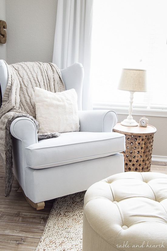
Emily used it in conjunction with Sherwin Williams Peppercorn in this space and I just love the result – see for yourself {here}.

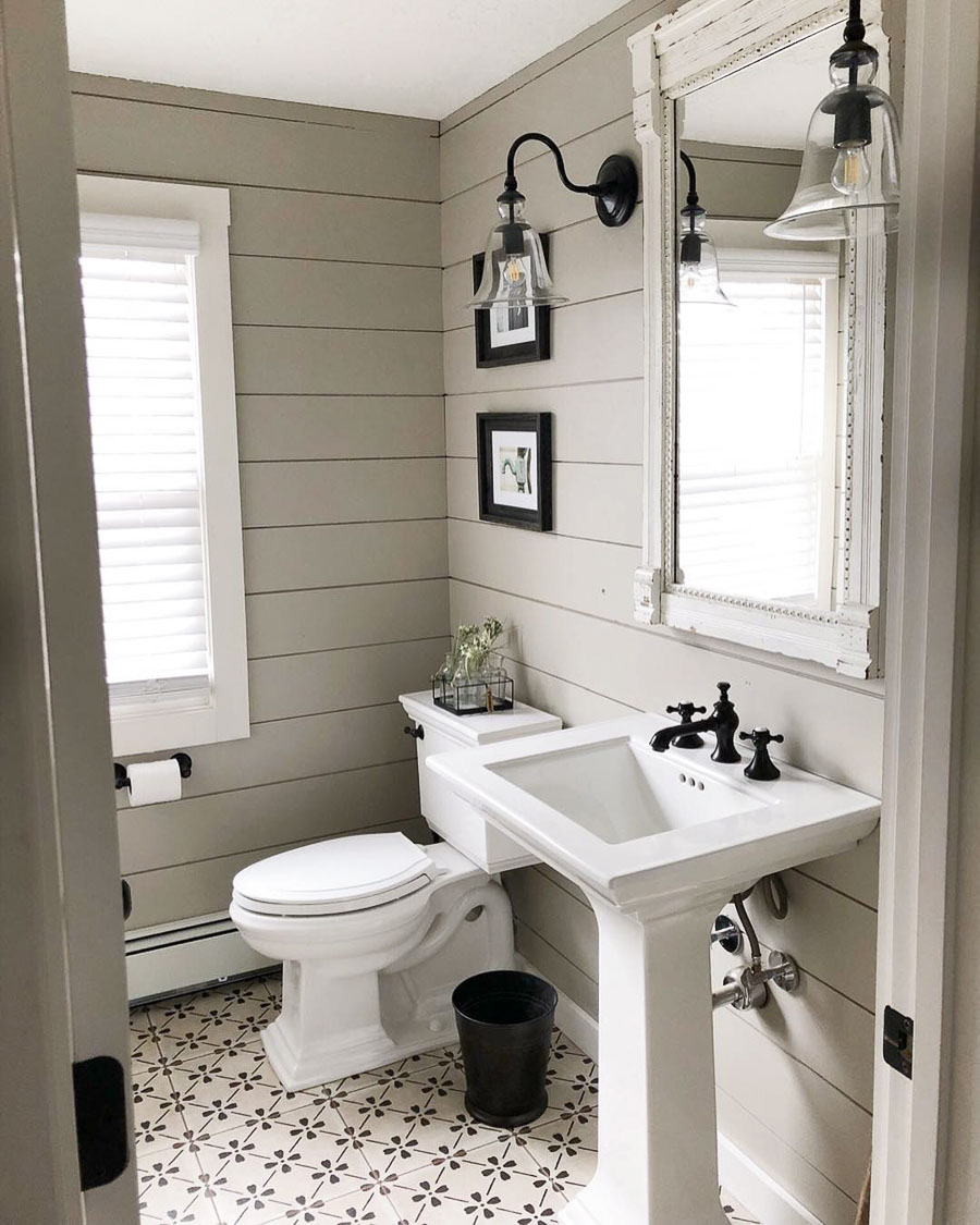
5. Sherwin Williams Worldly Gray (7043) LRV: 57
Worldly Gray is a not too warm, not too cold, not too dark, not too light greige paint color that’s high on my list of favorites! I love it so much in this fabulous farmhouse bathroom from Shannon of Fox Hollow Cottage:
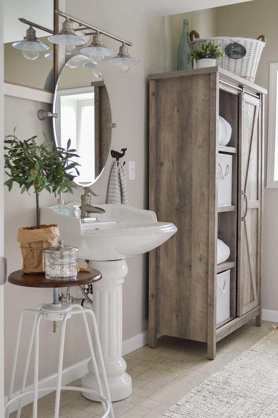
See more details of Shannon’s beautiful bathroom makeover {here}.

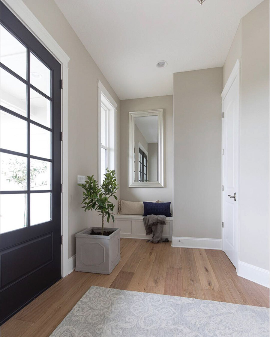
6. Sherwin Williams Repose Gray (7015) LRV: 58
Repose Gray is a color I’ve seen in person and love and it’s also one of your favorites. It can at times have some pinkish undertones depending upon the type of light it’s getting. I love this image of Repose Gray in Marnie Hansen’s fabulous foyer because it shows how the color can change quite a bit much depending upon how much light is hitting it:
You can follow Marnie Hansen on Instagram and see more images of her beautiful home {here}.

7. Sherwin Williams Agreeable Gray (7029) LRV: 60
Agreeable Gray is a color that has come up time and time again as being well-loved and working in a variety of spaces. It’s fairly light but still has enough depth to make it interesting and is a go-to color for several of my decorating friends. It’s just like the name of it says… agreeable in almost all spaces. Linda of The Home I Create used Agreeable Gray in her office guest bedroom and it looks like the perfect choice:
You can check all the details of Linda’s beautiful office guest bedroom reveal {here}.

8. Benjamin Moore Balboa Mist (OC-27) LRV: 65.53
Of the nine paint samples I put up on the wall in our living room, Balboa Mist had the second most purpley undertones of the greige paint colors (the most was Alpaca) but again, my space tends to bring out those undertones more than most. It was listed as a favorite of yours time and time again so obviously in most spaces, it works beautifully. I absolutely love it in Annie of DIY Decor Mom’s living room:
You can hop over to DIY Decor Mom {here} to see more pics of Balboa Mist in this beautiful space!

9. Behr Silver Drop (790C-2) LRV: 69.7
Behr’s Silver Drop is a light gray with just the smallest touch of beige to warm it up. It looks like a true gray in some spaces and more of a greige in others. It’s definitely a stunner in this gorgeous living room by Studio McGee:
10. Benjamin Moore Classic Gray (1548) LRV: 73.67
Classic Gray is the lightest of the bunch and is a beautiful, simple light gray without being cold – its name is actually an excellent description of it! This is the one greige paint color on the list that I didn’t sample on my living room wall, only because I knew that it was going to be too light for what I was looking for. But it was definitely a beautiful choice for the wall color in this great room by Studio McGee:

Runners Up
There were several runners up worth mentioning since they all got quite a few votes including Sherwin Williams Amazing Gray (7044), Sherwin Williams Knitting Needles (7672), Sherwin Williams Perfect Greige (6073), Benjamin Moore Edgecomb Gray (HC-173) (I’ve used this color with mixed success – one room I painted with it looked amazing and the other had purple undertones that I didn’t care for), Benjamin Moore Gray Owl (OC-52), and Benjamin Moore Pale Oak (OC-20).
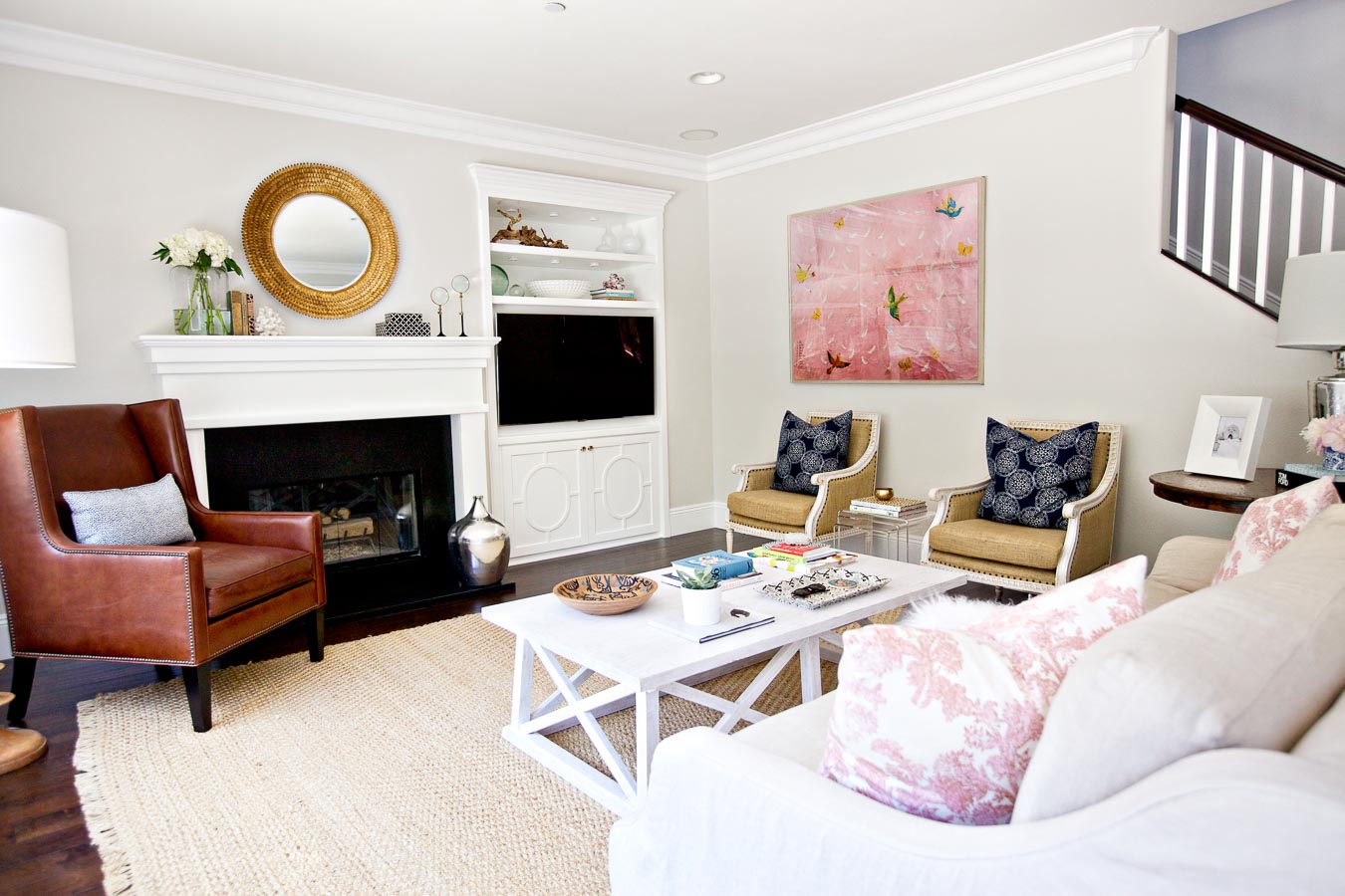
So which greige do I go with for our living room? I threw my four final contenders up on the wall above my fireplace (from left to right: Worldly Gray, Anew Gray, Revere Pewter, Agreeable Gray) to help me decide:
I ended up going with Sherwin Williams Anew Gray (second from left) and love it! It’s much lighter than my old color but still with lots of depth – so pretty! Thank you all for all of your great paint color input!
Want some other paint color inspiration? Check out my posts on:
The best white paint colors
Enjoy the rest of your weekend,


christy bailey says
Agreeable Gray is my hands down favorite!
Kris Jarrett says
It’s a great color! I think it might be just a little lighter than I want for this space but it’s definitely still in the running. Thanks for your input!
Jill says
Worldly gray seems to compliment your tile surround the best IMHO. We put SW Agreeable Gray in the guest bath of our previous home and it worked well with the western light. Greige is beautiful with lots of bright white trim and it will look great with your rattan.
Kris Jarrett says
Thanks so much for your input!
Denise says
While not a particular fan of SW (prefer BM), Anew Grey has my vote. Lighter color yet with a rich depth. Can’t wait to see your final choice.
Kris Jarrett says
Thanks Denise!
Romeogirl says
Worldly gray. I can’t believe accessible beige didn’t make the cut!
Kris Jarrett says
I should probably put Accessible Beige in the runners up group – it did get several votes but just not enough to make the top ten cut!
Karen Bunch says
Kris,
I’ll be excited to see how the living room looks in its new color. I love the more taupe colored greys but seriously they are all pretty.
Karen
Kris Jarrett says
Thanks Karen! Hope you’re having a great weekend!
Christine says
Is there an “after“ picture??!
Mary T says
My house is almost completely Agreeable Grey and I love it, but it is relatively light especially in a very sunny home like mine. (Definitely not complaining!) From the pictures of your room, I think I like Anew Grey. It just seems richer and looks great with your fireplace surround.
Kris Jarrett says
Thanks so much Mary!
Callie says
I’d love to see pics if possible! We’re picking out a color for our “cabin” home that has LOTS of windows so there’s LOTS of light and I’m wondering if we need a richer color than agreeable gray. Our ceilings are tongue and groove and our doors/trim are hemlock/wood, as well.
Anonymous says
Anew gray is definitely my favorite -contrasts well with white fireplace and pairs well with tiles. Great article!
Kris Jarrett says
Thanks so much for your input!
Fiona Saville says
Always hard to tell from a photo but I instinctively went to the Anew Grey before I even read your preference, it’s not too light and not too beige. Being a colour designer based in Sydney we don’t have the Sherwin Williams and Benjamin Moore over here, so I have no preconceived ideas about any of them. I love seeing how they come out in IG and other posts. Good luck!
Kris Jarrett says
I had no idea that those brands weren’t worldwide! Thanks for your input!
Gail Storti says
Oh gosh Kris…I’ve been in your exact predicament. I’ve had samples of most of the top ten and have used Edgecomb Gray and Revere Pewter. I don’t think you can go wrong with any of these, it comes down to how light or dark you want it to be. Good luck, I can’t wait to see which one you choose. It will be fabulous!
Kris Jarrett says
Thanks Gail! I think you’re right that these are all such pretty colors any of them would look nice! 🙂
Theresa Becker says
I love Revere Pewter, Its gorgeous!
Kris Jarrett says
Thanks Theresa! That’s a long-time favorite of mine!
Mary says
My vote is Anew gray. I tend to go more towards the greige colors that look more gray than beige though. We repainted our living room repose gray last spring and I still love it! Looks fresher and more up to date.
Kris Jarrett says
Thanks for your input Mary! Love Repose Gray!
Robin says
I too favor the anew gray sample for your space. I have anew gray painted in our bedroom and love it. Soothing, calm and never in the way. I also have agreeable gray in our sunroom and am a fan of that as well. Lots of great colors listed. I always paint up a posterboard and leave a 1″ unpainted border around it. This way you have the white contrast for comparison instead of your wall color (which can fool the eye and cause confusion). Works for me. Good luck! Always fun to bring in a new paint color.
Kris Jarrett says
That’s so good to hear! I usually use the poster board trick – it’s really nice because you can move the boards around the room. I just got lazy this time 🙂
Heidi says
I agree with you that Anew Gray looks to be the best choice. It looks so nice with the tile in your fireplace. I have many of the rooms in my home painted with either Edgecomb Gray or Revere Pewter and love greige paint colors.
Kris Jarrett says
Thanks so much for your input Heidi!
Julie says
Great post ! Totally understand the color choice dilemma. Have you tried sampling your colors on Small Wall paint sample boards (MySmallWall.com).- available are Sherwin-Williams. They have an adhesive back so you can move the color around your room and view color in different light and in the context of other colors … and you don’t need to mess up your wall . Good luck with your choice . I love SW Agreeable Grey !
Robbie Zeller says
Kris, We have Edgecomb gray in our home and I love it so much! We put rectangles of colors as you have here. A decorator friend suggested painting a swath of paint from floorboard to ceiling which was such a helpful tip for us. We had narrowed down to Revere Pewter, Pale oak along with Edgecomb gray. When we got those larger swaths up we could see clearly that Revere in our home looked like olive green paint that picked up the reflection of the surrounding wooded areas through our large glass windows along the back of our house. It was easy to see the better color for us when we went through this exercise and watched all throughout the day for light changes. It was helpful as well to see the paint samples near the white floorboards and the wood beams of the ceiling in one eye glance.. Your spaces are gorgeous and I am certain you will see which is the best one for your home!
Kris Jarrett says
I can see how that would be helpful because even when you look at the current color around our fireplace, you can see how the light from the top to the bottom changes the look of the color so much!
Kimberly says
I have anew gray in my dining room and love it! With or without natural light it doesn’t change color…beautiful!
Kris Jarrett says
That’s great to know! Thanks Kimberly!
Sue Smith says
I’m a huge fan of Anew Gray & Agreeable Gray. I have Anew Gray in my kitchen that has lots of sunlight and both in my living/dining room space. The dining room had wainscoting, so I used Agreeable Gray on the walls (and living room), but used Anew Gray on the wainscoting including all the molding. Since they’re on the same color strip, they blend beautifully from room-to-room. I think Anew Gray would look great in your living room.
Kris Jarrett says
So good to hear!! Thanks Sue!
Sharon H says
I actually like the taupe coffee colored paint you already have on the wall since it helps the whiteness of the fireplace stand out makes it look crisp and clean and the tile looks great with it. The other grieve colors look like they’re dirty against the white and it will tone down the white so it looks washed out. Sorry….I really like the dark taupe. Not sure why you would change it. ? a lot of us are soooo tired of gray now unless it’s charcoal gray.
Kris Jarrett says
I totally understand that – I actually love how the current color looks around the fireplace too! The issue is that the fireplace is directly across from the only window in the room so this area gets good light so looks fine with that dark of a color but the two ends of the room are really dark so the current color looks pretty dreary in the rest of the room. Definitely want to lighten things up! 🙂
Gina says
It is ironic, I came to the post looking for greige recommendations but became enamored with the taupe color you have. What is the name of it?
Hitaishi says
I would like to know the name of the existing color too. Please let me know if you still recall
Kris Jarrett says
The existing color is a tweaked version of SW Keystone Gray – the exact formula is at the end of this post: https://www.drivenbydecor.com/house-tour-dining-room/
Elizabeth Whitesides says
Hey girl – this post’s going in Evernote for my next painting project! thanks.
My eye went straight for Worldly and Anew as my votes for the best fits for the fireplace surround & your furnishings. Then I noticed how warm toned your flooring is (or just looks on my Mac). Have you painted any sample areas near the baseboards to see what your finalists look like closer to your hardwoods?
One tip to pass on that a decorator shared with me: Instead of painting swatches on the wall, I now paint manilla file folders with my samples. If you paint the whole folder you end up with a nice big, sturdy, portable “paint chip” that you can move all over the room or house. Painters tape is great for fixing them to the wall without damage. They are also great to take furniture/accessory shopping as a big sample is so much more helpful than a tiny paint chip. I am notorious for trying HUGE numbers of paint samples, so this has saved me from my home looking a sight while I waffle around choosing. We will not speak of the 30 options I tried in my kitchen before I knew this trick…
Chelsea says
My whole first level is anew grey and I love it, so that’s my pick for sure. It looks great with your fireplace colors too!
Michelle says
I love worldly gray! I put it in our family room/kitchen and master bath. It’s a lighter option, but still makes everything else pop.
Lori says
I vote for Anew Gray. Makes your fireplace POP!
Nancy says
I had my whole house painted worldly gray 5 years ago when I moved in and I still love it. That’s pretty amazing for me. I can see why you lean toward Anew Gray and I think it’ll look great if you choose it.
Dian Owens says
SW Anew Gray has my vote. My master bath is windowless, so I reduced the color saturation of Anew Gray by 50%. It looks great with the large white subway tiled shower and the SW Shoji White walls in the adjoining room. The Light Reflectance Value (LRV) # is important when choosing a room’s paint.
Anonymous says
Gorgeous!! Thanks for posting. Anew Grey would look gorgeous! Could you tell me the color of your trim and fireplace mantle?
Paula Nicholson says
Anew Gray gets my vote. I think it looks great with the tile surround on your fireplace. Can’t wait to see what you do!
Cassie says
I have Anew Gray in a few different rooms and I LOVE it. I actually have Agreeable Gray, Anew Gray and Revere Pewter in my house and Anew Gray is my favorite. I don’t think you’ll go wrong with any of your choices though. Can’t wait to see!
Cindy says
Without looking at your choice I thought Anew Gray would work best in your room. Thanks for the in depth research on greige!
Karen says
Based on what you said you were looking for I tried to guess which one would work best and also landed on Anew Gray. I can’t stop thinking about how good it would look in our family room but as you point out – best to test more than I think I should and see what they look like over the course of a few days. Thank you for this very timely comparison.
Kinga says
Yes, Anew Gray looks the best, it was my #1 choice when I started to read this post.
Melissa April says
We painted Anew grey through most of our main level and it turned sage green at night. Hated it!! Repainted Fine Grain by dunn Edward’s and found that to be the perfect greige for our home. I wish I could share a pic to show just how green this color turned.
Jennifer says
OH no! I am also looking for a good gray to paint in my home. Good to know!
Jennifer says
Anew gray
Karen says
Just from looking at the picture, I thought Revere Pewter worked with the fireplace surround, but then I looked up at the gray ceiling, whatever works for you,
Jane Reed says
I think that Revere Pewter blends better with your fireplace tiles, but you get to choose! My fitness area is painted Agreeable Gray . It’s a very light gray – wouldn’t provide a lot of contrast.
Anonymous says
Anew gray!
Sarah says
Which would you recommend to go with a wood trim? We have oak and I need a paint color that is light but won’t look white against natural wood.
dezyn-diva says
Second from the left was my first choice when I opened your page. Go with your gut. They are all so close, just don’t like the light ones much.
LH says
What color is your original wall (in the picture where you have the 4 samples painted above the fireplace?
And what is on the fireplace to make that design?
Thank you!
Shannon Fox says
What a beautiful collection of greige paint colors! So many gorgeous rooms as examples too!
Thanks so much for including our bathroom.
~ Shannon
sharon nash says
Are accent walls dated? To update a room do you paint one color or use a accent wall?
Karen says
I would say accent walks are on their way out. I would stay with a light, airy colour throughout the house.
Karen says
Hi there,
I loved the look of revere pewter in your posted picture of it, but when I used it in the house I am painting, I was very disappointed as it was heavy and much darker than the picture portrays, even though it is in a room with a large picture window, a patio door and another window nearby.
Kim says
I like Wordly Gray but you did say you didn’t want it too light, but I like that color with the fireplace. Since you want a little darker I really like Anew Gray especially with the fireplace!
Caroline says
About to have entire house painted agreeable gray, and I’m so nervous now, I had finally made up my mind and seeing it on your wall and the example photo it looks so light. I have a large family room that opens to the second floor and a two story stone fireplace. I want everything to work together. You can see up to the second floor so if I get it wrong it will be a gargantuan mistake. It looks darker when I painted a few sample spots around my house. Dining room looks really light like your photo. Why is this so hard??
Caroline says
To finish above comment, I like anew gray and revere pewter for your room. They both look great in photo. You are wise to keep them up for a few days and look at during different lighting. I’m doing the same. Still hard though. ?
Susan says
I love silver drop. I am looking forward to trying a sample of silver drop in my bathroom. I have blue tiles on walls and beige floor tiles.
Thank you.
rob says
crushed ice definitely should have been in the pile of consideration
Denise says
With chocolate brown furniture, can you suggest a few grays which will make med size living room look larger yet cozy?
Kris Jarrett says
I don’t have a specific color to recommend (the same paint color can look quite different from house to house) but with chocolate brown furniture I would definitely go with something on the lighter end!
Pat says
Your house is beautiful. I love Anew Gray and that is what I have in my family room. We just took a wall down between the FR and the kitchen and I’m not sure it will go with my maple cabinets. I’m thinking of repainting with worldly gray.
Kris Jarrett says
Thank you! It’s always a challenge when two spaces are open to each other to find the right color that works with everything!
Jo says
What is your paint color before painting with Anew Gray?
barbara eittreim says
I want the color your living room had before you painted Anew. But just a tad brighter. Your thoughts?
Jackie says
I’m looking to blend oak floors with grey / greige. Needing light walls and darker trim . Going with white ceilings. Any ideas?
Ronald says
Seattle mist
Ashley Henderson says
Oh my goodness, I’m in love with the tile around your fireplace!! Great choice for paint color but can you tell me anything about where you found your tile or name /brand etc. I’ve been looking for the perfect tile for my bathroom and that is it! Thanks so much!!
Cindy Gilroy says
What was the color of your walls originally? In the photo where you have the 4 samples above your fire place.
Kris Jarrett says
It’s a slightly tweaked version of Sherwin Williams Keystone Gray – you can find the exact formula at the end of this post: https://www.drivenbydecor.com/house-tour-dining-room/
Jen says
What was the original color of your living room before you re-painted it? That’s the color I need for my great room!
Libby says
Have Worldly Gray now, but Edgecomb last home. Both are beautiful. I have SW Tinsmith in master and beautiful too. It’s between blue abd and gray. But not cold.
lisa stewarat says
what cause a paint color not to look the same on the walls i tryed accessible beige and on one wall i loved it but the other walls it looked darker color and i like it on the other wall cause it was looking like a light tan color but on the others a dark gary color
Kris Jarrett says
Paint colors are really tricky like that! Often it’s what type of light the wall gets (how well lit or dark that specific wall is) and it can also be affected by the reflection of other furnishings in the space.
Mary says
I need help/ideas to change my living room. Not sure what to do. We put up crown molding and we need to pick out a new paint color. Any ideas you share would be greatly appreciated. Thank you!
Shirley says
The Anew gray was my favorite when I browsed the pictures. With the accessories you show in the picture, it will definitely look nice in your living room! Can’t wait to see it!
Kris Jarrett says
Thanks Shirley – I’m really happy with how the Anew Gray turned out! I’ll have to take a pic of it to add to this post!
Mary says
Hi Kris…
I used SW Serious Gray as an accent wall to draw your eyes up to the high ceiling in my great room. The other walls are SW Rock Candy and it looks so custom. I love it. Although Serious Gray didn’t make your list it’s definitely something to try sometime.
Thanks for all your info! Keep them coming! You rock!
Have fun.
Emily says
This is really helpful. Thank you! Is there one above that you feel would be best for cabinets, we would like a light griege on our kitchen cabinets (the space has little natural light) and then off white/white walls.
Ann says
Worldly Gray is my go to color. I have used it in two homes with east and west orientation. Alpaca looked great in the basement at our previous home in rooms with and without natural light.
Lisa Seiler says
I love this tile floor. Can I ask the name of it?