Choosing the right paint color for your space can be a challenge! What a paint color looks like on the color strip isn’t always what it looks like once it’s painted on your walls. Today I’m sharing 8 tips on how to choose paint colors to help you find the perfect color for your space! (post includes affiliate links; full disclosure statement available {here})
Don’t Expect a Paint Color in Someone Else’s Home To Look the Same in Yours
Paint colors often look very different from house to house and even from room to room within the same house. Just because a paint color looks fabulous in your friend’s house or in a magazine doesn’t mean that you’ll get the same look in your own home. The amount of light coming into your room, the direction your room faces, and the furnishings in the room can all have a big impact.
Even within a single room of your home, a paint color can look quite different from wall to wall or even in different spots on the same wall. Our living room in our previous home is a great example. I painted the walls Sherwin Williams Anew Gray (which I loved!) and was always amazed by how the color varied SO much in different spots on our fireplace wall:
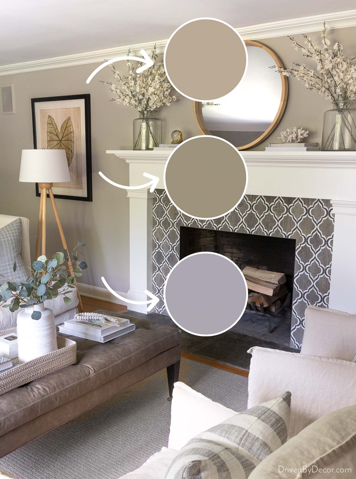
The purple hue at the bottom was due to the rays of the “cool blue” northern light coming through the window directly to that spot at certain times of day. About 90% of the room got light similar to the top sample, which is the color I was going for, but I only knew that by looking at paint samples in different spots throughout that room.
This is why it’s so important to view your paint sample in different rooms, on different walls and heights of the same room, and at different times of the day. It’s the only way to get an accurate idea of how a color will look in your space. Which brings me to…
Always Sample Your Paint Colors
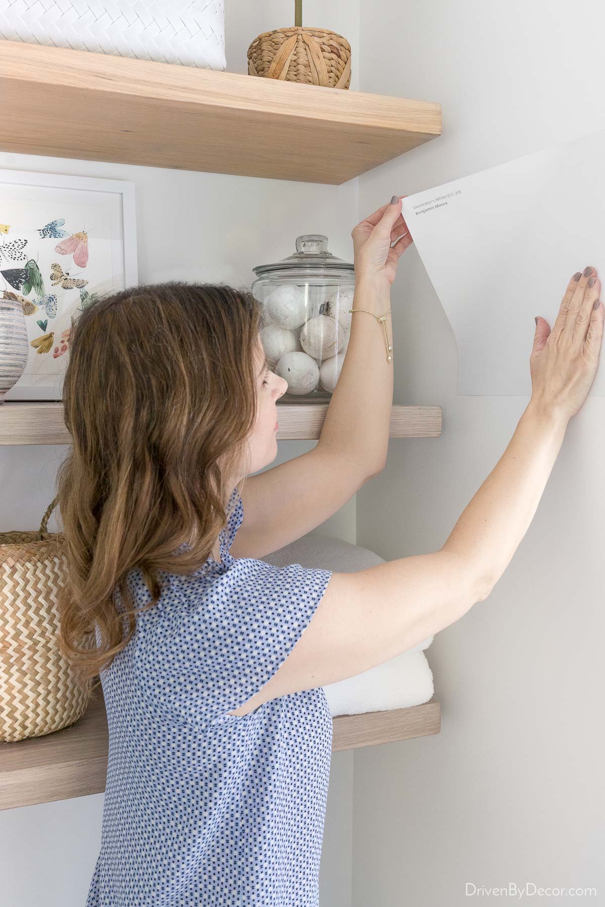
It’s pretty tough to make a good paint color decision by looking at digitally printed color strips. It’s important to see larger samples of the real paint in your space. I used to do this by getting a small sample of paint and brushing two coats of it on a foam board that I could move from wall to wall and room to room. But now I use Samplize peel and stick paint samples, which make testing paint colors so much easier.
Samplize samples (found {here}) are (1) much larger than typical paint store samples and (2) made with the actual paint rolled onto the sample instead of being digitally printed. I love that you can stick and re-stick the samples on your walls to test them out in multiple spots:
Understand LRV
Every paint color has an LRV, which stands for Light Reflectance Value. The scale ranges from 0 (pure black that absorbs all light) to 100 (pure white that reflects all light). The lower the LRV, the darker the paint color will look and feel once up on the wall.
How can you use LRV to help decide on a paint color? If, for example, you have Sherwin Williams Alpaca (a greige paint color) on your bedroom walls and it’s just-right in terms of brightness but you want to repaint with blue, compare the LRV of Alpaca to the blue paint colors you’re considering. Alpaca has an LRV of 57, so Benjamin Moore Smoke (LRV of 56) is a good choice for a blue with that same not-too-dark, not-too-light look.
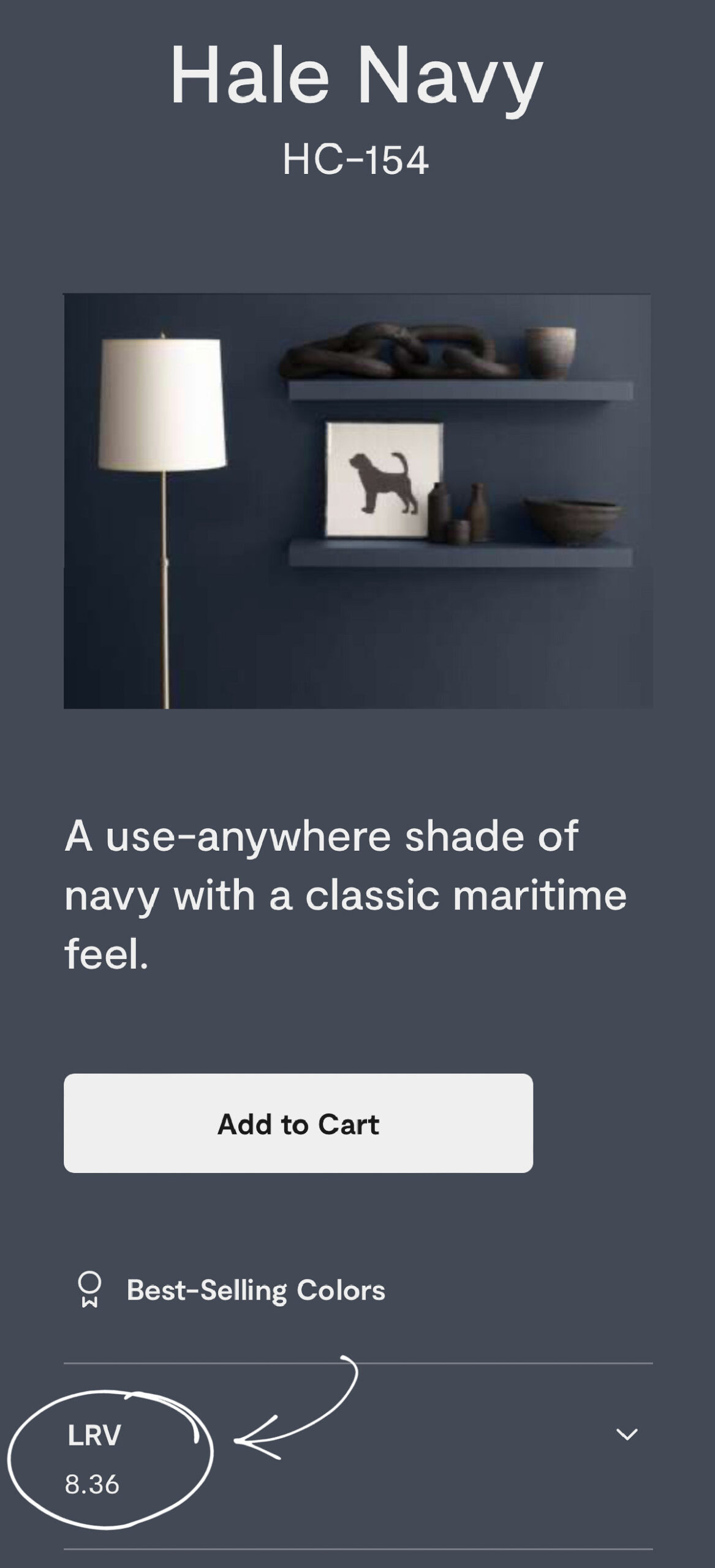
The LRV is usually not printed on the paint chip but can be found on the paint company’s web page for that color. For Benjamin Moore colors, you can find it here:
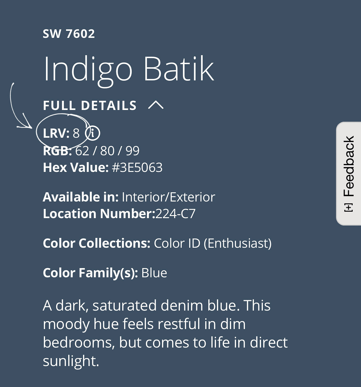
For Sherwin Williams, you can find it here (click on “full details” for drop-down info):
Don’t Color Match
It can be tempting to take a color from a more expensive brand of paint like Benjamin Moore and have it mixed in a less expensive brand like Behr. The problem is that the base paints and the colorants from each company are different, so you’re never going to get an exact color match.
This is especially true with white paint colors. Whenever someone tells me that the white paint color they chose has totally different undertones than what they were expecting, my first question is whether they color matched it with a different brand. 95% of the time, their answer is yes, and that’s why they didn’t get the color they expected.
I’m not saying that there aren’t instances where you happen to get a pretty good color match. However, it’s far from guaranteed and, in my opinion, not worth rolling the dice on unless you’re fine with the possibility of it not being an exact match to the color you expected (like in a kid’s room).
Choose Your Sheen Carefully
The sheen of your paint will affect both the look and durability of your painted walls. A shinier satin or gloss finish is going to make your paint color look brighter than a flat or matte finish. For example, our “circus room” has Simply White on both the walls and the shiplap ceiling. However, they look like two very different whites, with the satin finish on the ceiling making it appear to be a much brighter white than the flat finish on the walls:
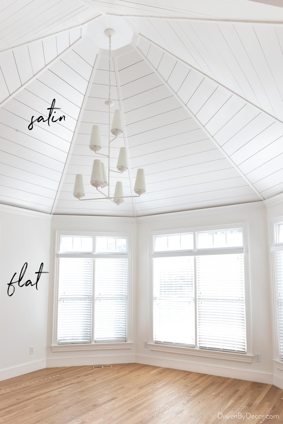
Also consider your lifestyle and the type of room you’re painting when deciding on a paint sheen. Generally, the glossier the sheen, the more scrubbable and resistant to moisture your painted walls will be. The flatter the sheen, the more it will hide imperfections, and the easier it will be to touch up. These are typical uses for the different sheens:
- Gloss & semigloss – used for baseboards, window trim, and cabinets. Semigloss is also sometimes used in bathrooms where there’s a lot of moisture since it will bead up on the paint instead of soaking in.
- Satin – used in high traffic or high moisture rooms such as kitchens, kids’ rooms, hallways, and bathrooms
- Eggshell – the most common sheen for walls with moderate use, such as bedrooms and living rooms
- Flat & matte (matte has a touch more sheen than flat so is more scrubbable) – used for walls in low-traffic rooms and for ceilings
While these are typical uses for the different sheens, I actually break the rules and paint all of the walls in our home flat or matte. This is because (1) I visually prefer the look of a lower sheen, (2) I like how easy low sheens are to touch up (with higher sheen paint, you can usually see a sheen difference between the walls and the touch-up spots), and (3) I no longer have young kids running around putting their hands all over the walls.
Even for our master bathroom remodel, I went with a matte finish in Benjamin Moore’s Aura Bath & Spa paint that’s made for moisture-prone areas (color is Benjamin Moore Chantilly Lace):
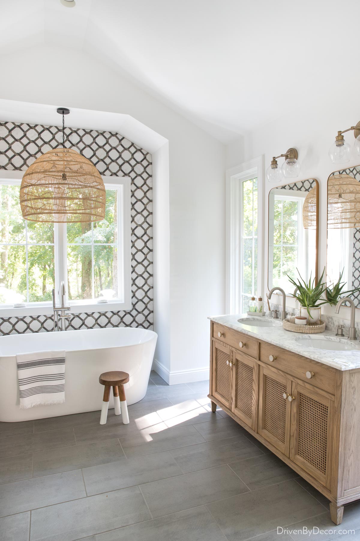
Sources: Double vanity | Vanity knobs | Bathroom faucets (brushed nickel) | Vanity lights | Vanity mirrors (gold) | Soap & lotion sink set with tray | Woven pendant | Freestanding bathtub | Tub filler | Dipped leg stool | Striped towel
Don’t Choose Paint First
When you’re decorating a room, don’t choose the paint color first and then design the room around it. Instead, plan the design of your space (furniture pieces, fabrics, etc.) and then find a paint color that works with everything. There are thousands of paint colors out there, so you’ll always be able to find one that works with your room design. On the other hand, finding decor that works with a specific paint color can be a lot more challenging!
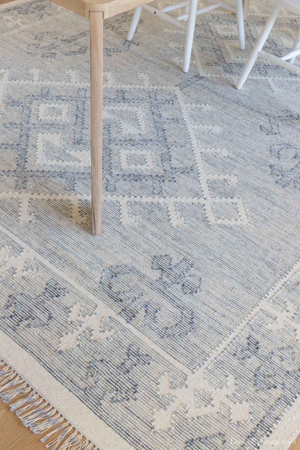
I always start my room designs with 1-2 things that I’m super excited about using in the space and go from there. It could be a pillow fabric, a piece of art, a rug, or even an heirloom piece of furniture. For example, our dining room was designed around {this rug} which I absolutely fell in love with:
All of my other choices for the room, including my art and sideboard lamp, were chosen because they complement my statement-making rug:
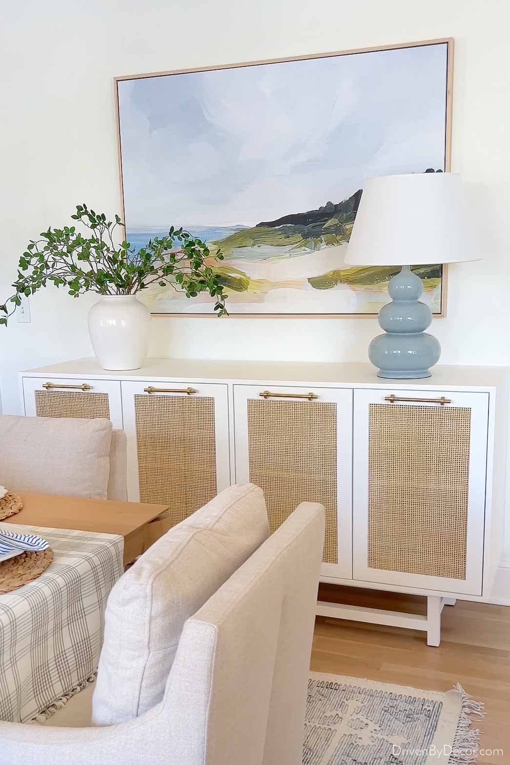
Room sources: End chair | Side chair | Table | Sideboard | Lamp | Vase (similar) | Greenery | Art
Try a Change in Lightbulbs
Choosing a paint color isn’t easy, and the reality is that you may not always get it right. Want to know a trick of the trade if your paint color isn’t quite what you were looking for? Sometimes a simple lightbulb swap can make all the difference! There’s a huge range in lightbulb “temperature” (how yellow or blue the light is) from bulb to bulb (you can find the Kelvin rating on the side of the lightbulb box):
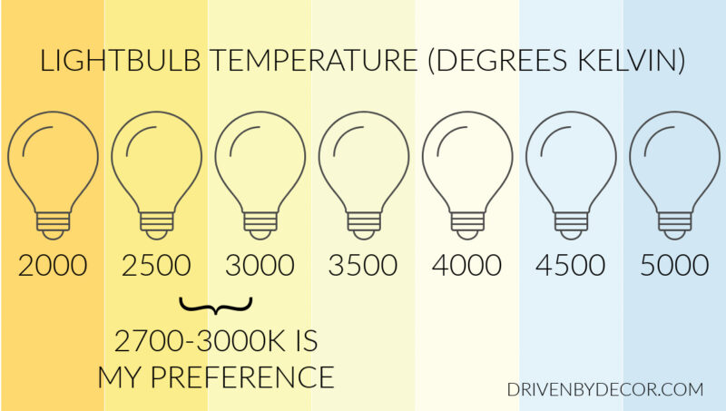
Lower Kelvin bulbs are warmer, while higher Kelvin bulbs are cooler. If your paint color looks warmer (more yellow-toned) than you expected, switch your light bulbs to ones with a higher Kelvin. Or do the reverse if your paint color is a cooler (more blue-toned) color than you expected. It can make a big difference, especially in rooms like bathrooms and laundry rooms with little to no natural light.
Create Color Flow
When choosing the paint color for one room in your home, don’t do it in isolation. Take the paint colors in the rest of your home into account to create color flow from room to room. You definitely don’t need to paint every room in your home the same color, but choosing colors that work well together gives your home a much more intentional feel.
Check out Sherwin Williams’ Color ID palettes to get an idea of colors that mix and match well. I especially love their “minimalist palette” which consists of these six colors plus several others:
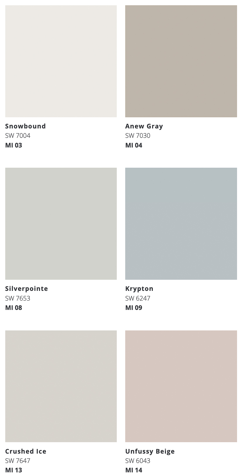
Having a whole-home color palette doesn’t mean you can’t go rogue and use a paint color or two that are especially bold or different from the rest of your home. As far as I’m concerned, anything goes in kids’ rooms. Powder rooms and laundry rooms are also fun rooms to get creative with color!
Now that you’re a color-picking pro, put painting a room or two on your 2023 to-do list. It’s so true that a simple change in paint color can totally transform a space! See my posts on how to paint a room and how to paint a door if you want tips on painting a space yourself. And if you want recommendations for favorite paint colors, check out my posts on:
XO,


