

Sherwin Williams Anew Gray is one of my all-time favorite greige paint colors! Come take a peek inside our living room to see how it looks in our home and how it stacks up to other gorgeous greiges.
Not long after moving into our Connecticut home, we painted both our living room and dining room a dark greige, Sherwin Williams Keystone Gray. I loved this rich greige color in our dining room, but in our living room (which didn’t get as much natural light), it felt a bit too heavy.
So after several years of trying (and failing) to grow to love it, I finally decided to lighten things up by repainting with a lighter griege. After delving into my paint color options, I narrowed it down to four beautiful contenders:
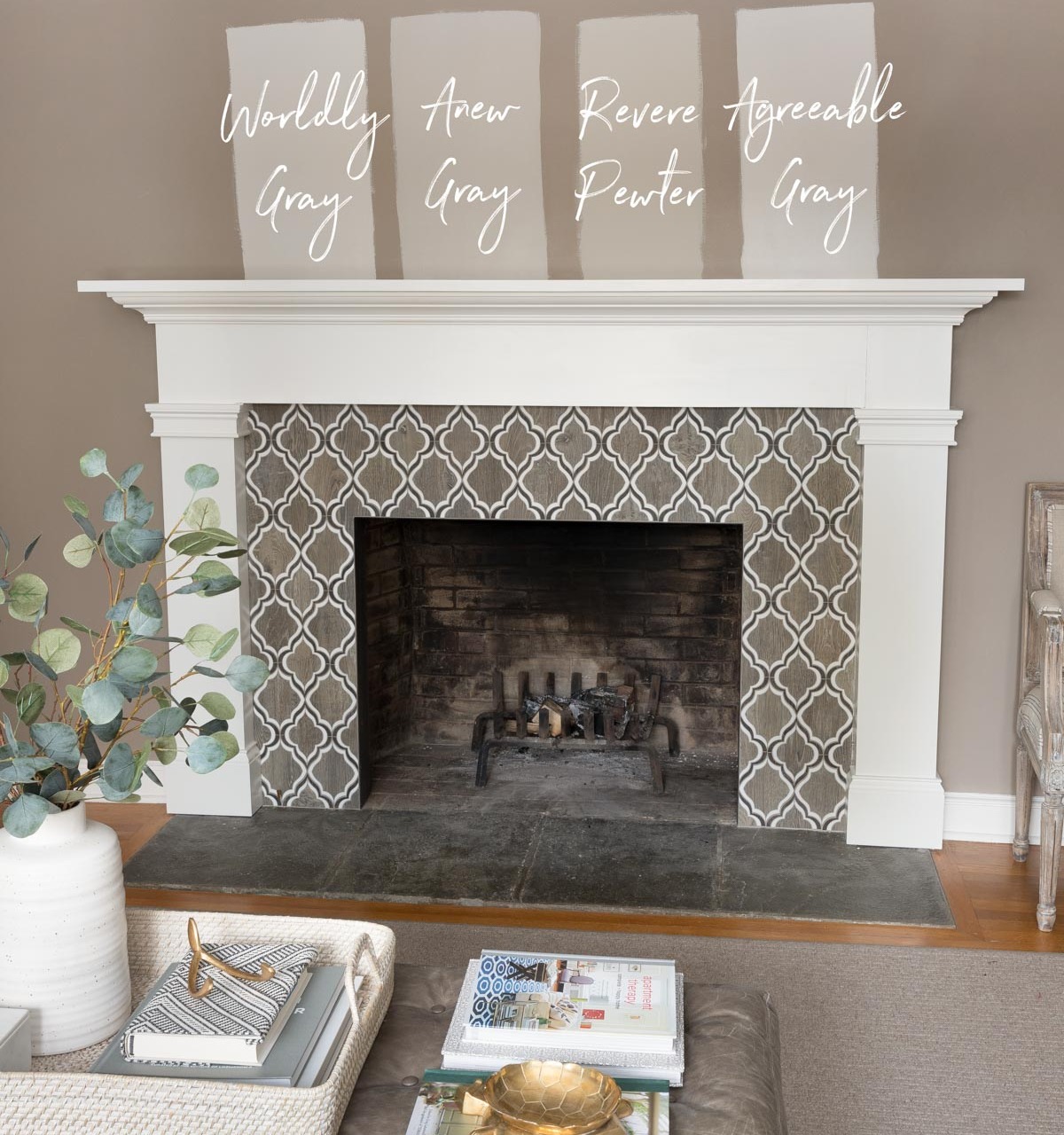
My final pick was Sherwin Williams Anew Gray and I couldn’t have been happier with it! After months of getting questions about this color every time I shared photos of our living room, I thought it was time to share why I love it and how it compares to similar greiges, while giving you a little tour of our living room along the way! (post includes commissonable links; for more information, see my full disclosure statement {here})
Anew Gray in Our Living Room
I wanted a neutral paint color for our living room and went straight to the greiges because they’re the perfect Goldilocks choice – the beige brings warmth while the gray tones keep things from looking dull or muddy. Sherwin Williams Anew Gray is a mid-toned greige that offers depth and richness without being too dark which is exactly what I was looking for.
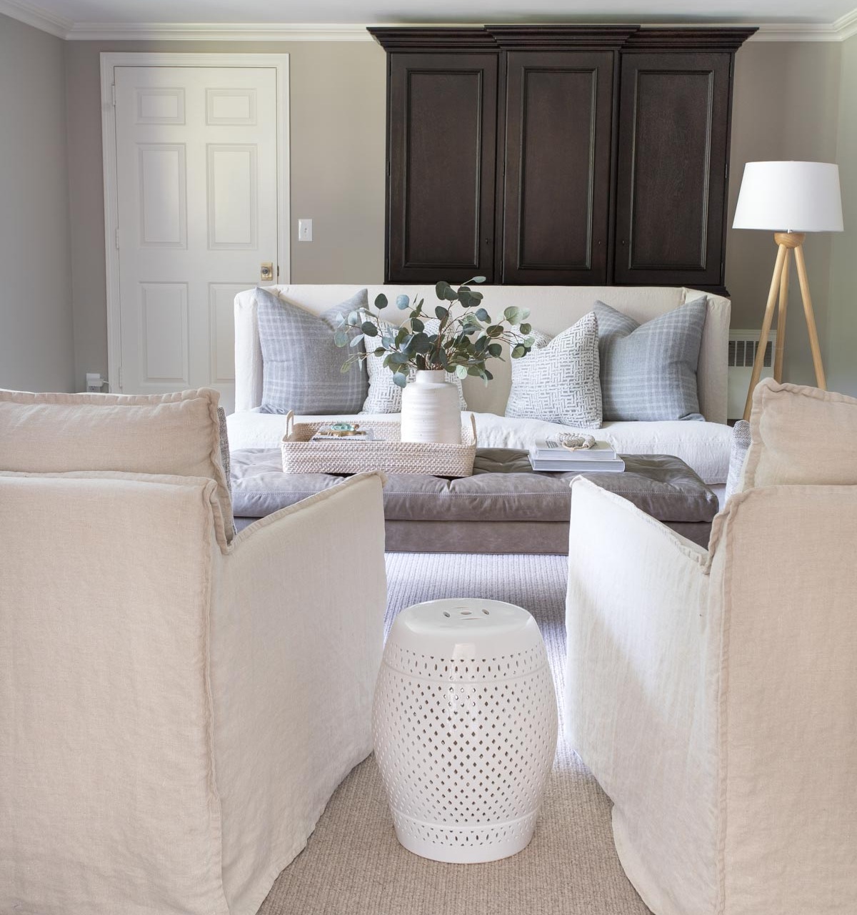
Here’s how it looks in our space – you can really see how the color of Anew Gray changes depending on the light it gets:
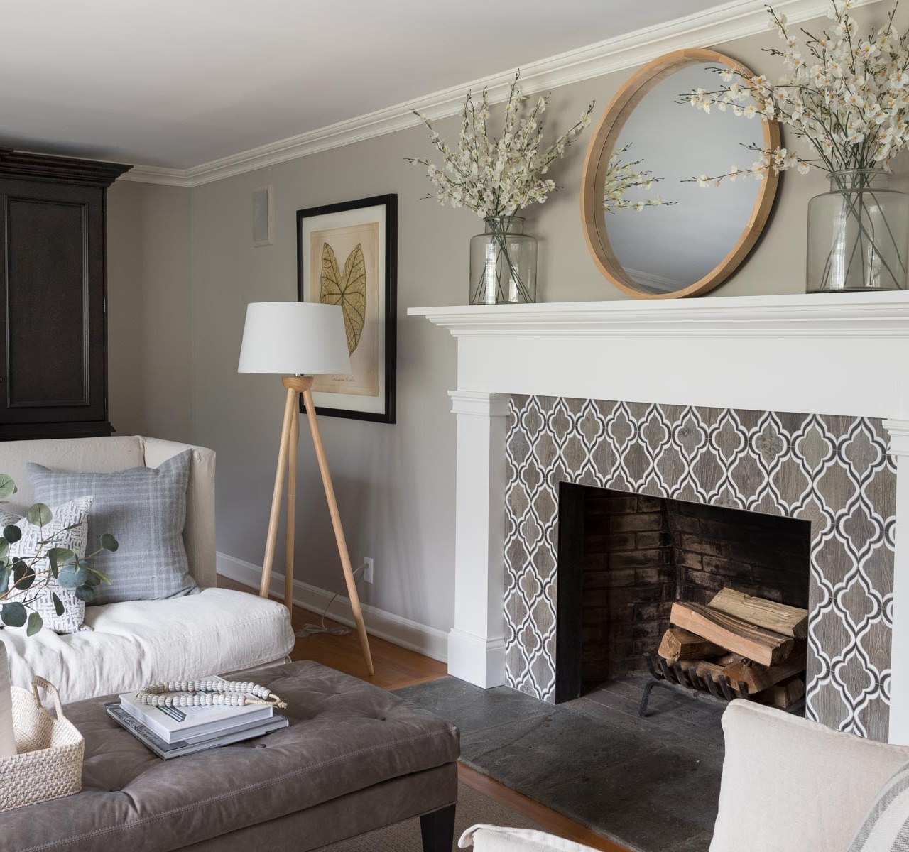
Sources: Loveseat & ottoman (custom order from Lee Industries) | Linen swivel chairs | Wood floor lamp | Round mirror over fireplace | Vases on mantel – no longer available | Faux flowers in mantel vases
Take a close look at the wall near the floor and you’ll spot a soft purple undertone. That’s the result of the cool light streaming in from our north-facing window across from the fireplace. Higher up on the wall and throughout most of the room, Anew Gray reads like a true greige. In the darker corners, like beside my black cabinet, it takes on a deeper, richer tone.
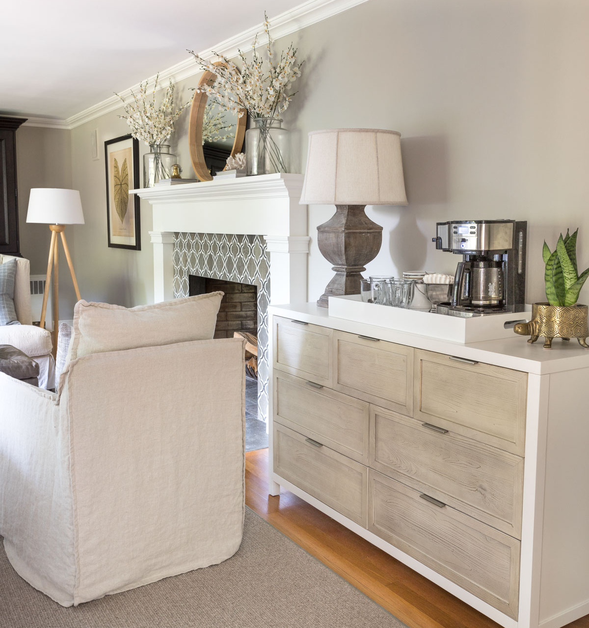
Looking at the same space on a different day, the top of the wall still looks a bit different from the bottom, but overall the color feels warmer and less gray since there was less cool northern light in the room this day:
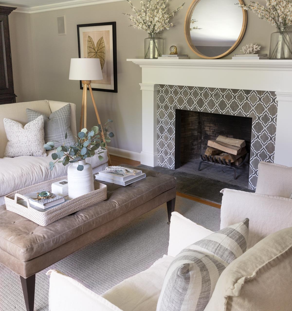
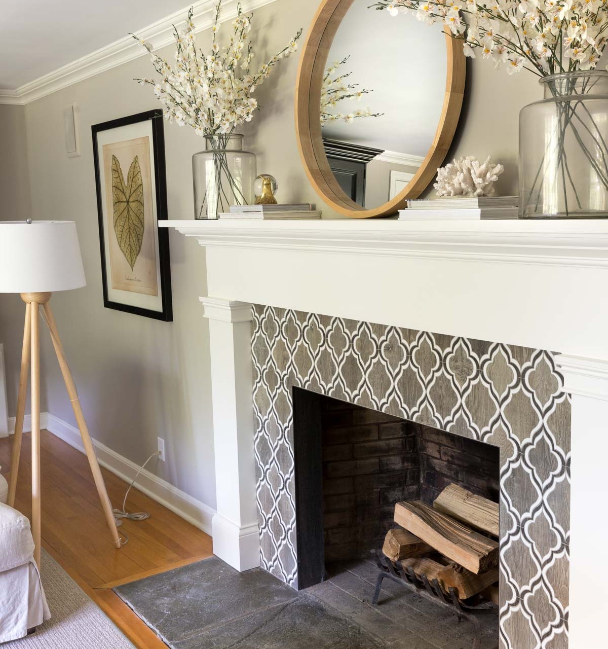
Sources: Fireplace tile | Round mirror over fireplace | Vases on mantel – no longer available | Faux flowers in mantel vases | Decorative snail | White coral (similar) | Wood floor lamp
Other than the purple undertones in the small portion of our room with the direct northern exposure light (which will happen with any greige), I see no other obvious undertones with Anew Gray in normal lighting. It’s just a nice not-too-light, not-too-dark warm neutral.
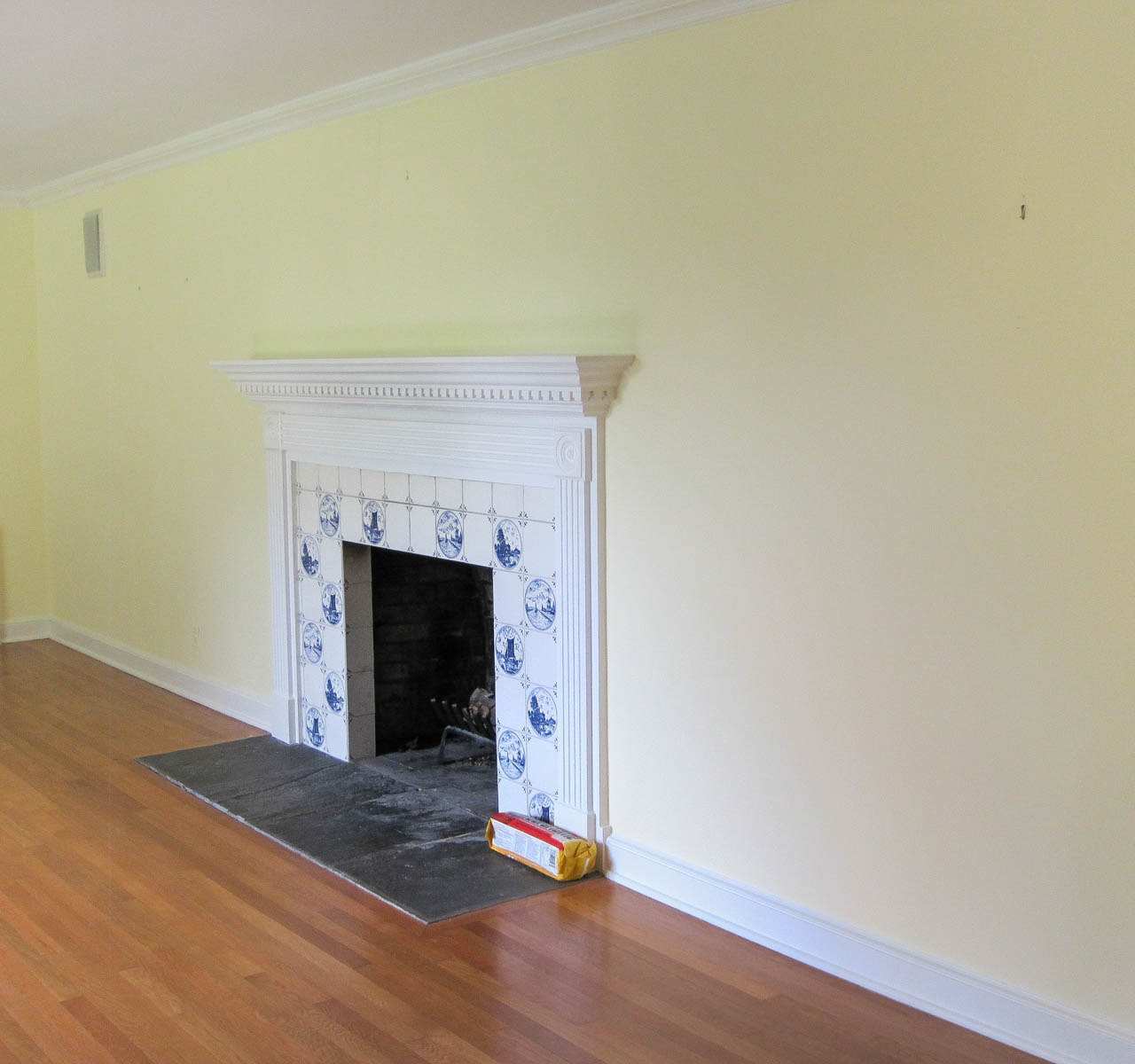
It’s fun to look at these pics and remember how far this space has come since we first moved in! Do any of you remember what it looked like way back then?
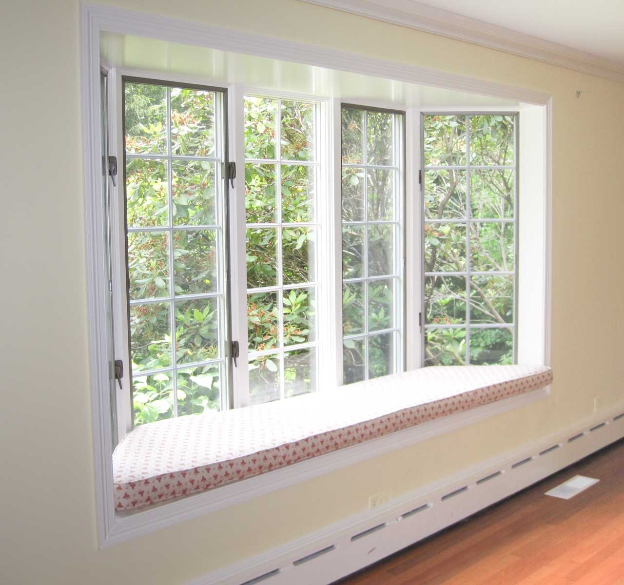
My favorite glow up is the window seat on the wall across from the fireplace. It was one of Hope’s favorite places to hang out and have a bird’s eye view of what was going on outside – I sure miss this sweet little face:
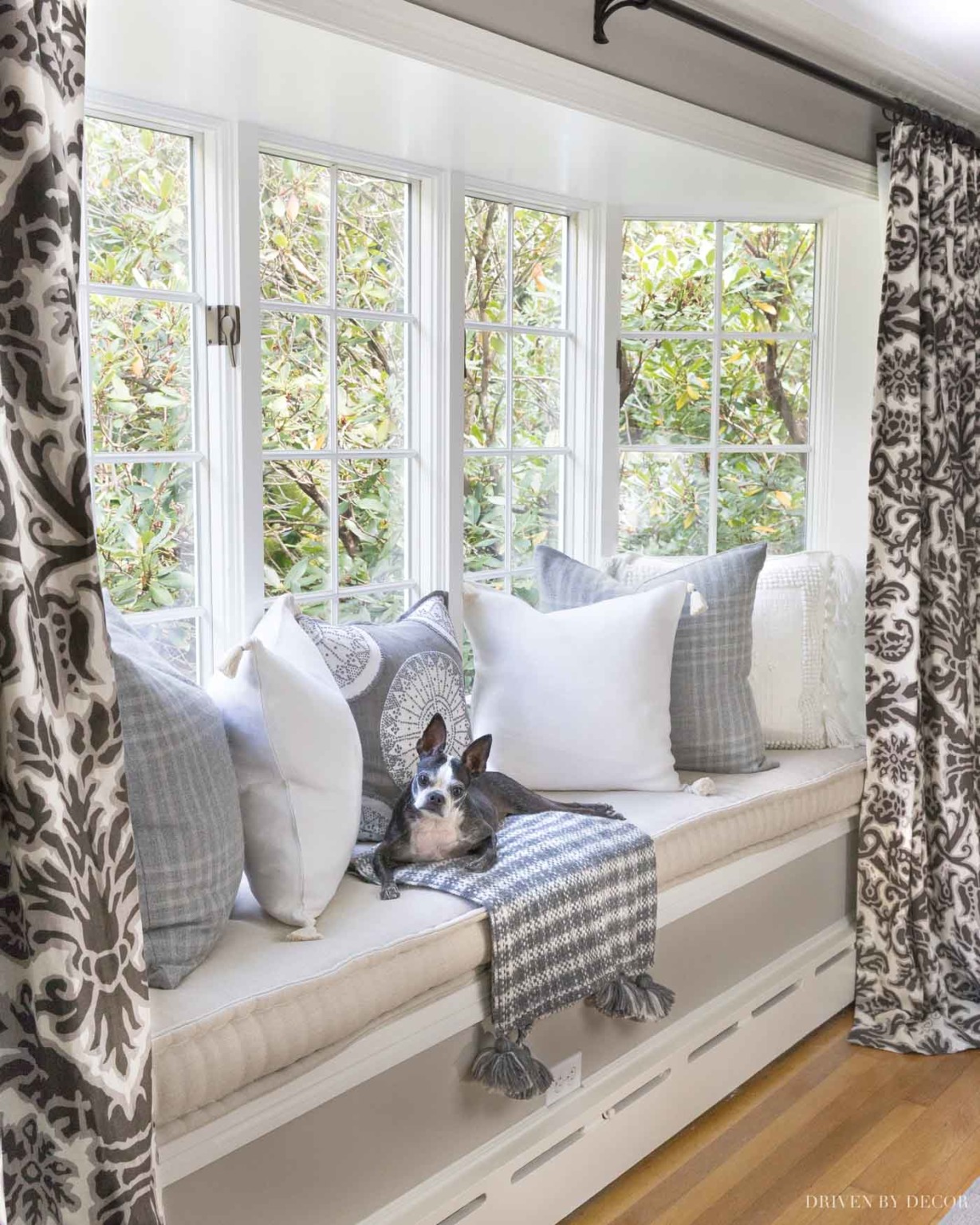
(See my post on French mattress cushions for cushion details)
Here’s what it looked like a few years back on move-in day:
Now let’s get back to business…
What Sheen of Anew Gray Paint I Used
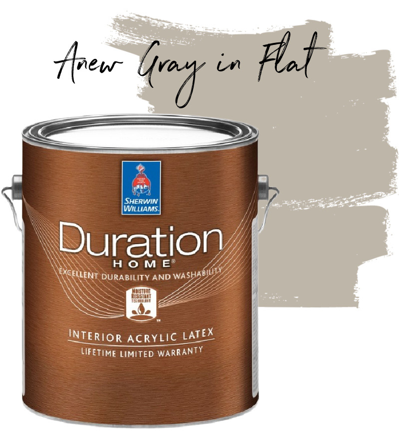
I painted Anew Gray in the flat finish of Sherwin Williams’ Duration Home Interior Latex paint. I use flat or matte (close to a flat sheen but more scrubbable) for all of the walls in our home because it hides imperfections better than higher sheen paints and it’s super easy to touch up.
The trim in our living room is painted Benjamin Moore Cloud White in satin. There are a lot of different whites that would work for trim with Anew Gray but my personal preference is to use a warm white when you have a warm wall color. Check out my post on the best white paint for interior walls for more details on other popular warm whites including two other favorites of mine, Benjamin Moore White Dove and Simply White.
Anew Gray vs. Other Similar Greige Paint Colors
If you’re thinking about using Sherwin Williams Anew Gray in your home, you’re probably debating between it and several other similar greige paints colors. So let’s do a comparison between Anew Gray and the six other greige paint colors that people are most often deciding between (according to Google). To show you a true comparison, I bought samples of all six paint colors from Samplize who sells 12″ x 12″ squares of paint finishes with an adhesive backing. Here’s all six of them on our Anew Gray walls:
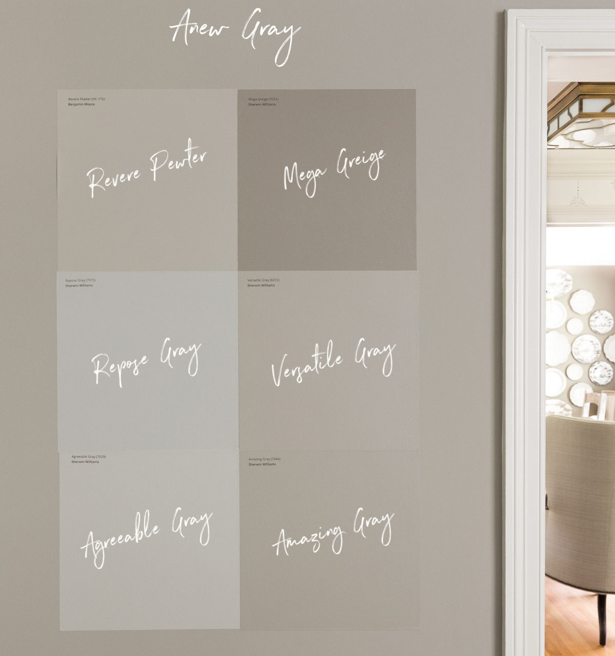
These are true painted samples (not computer generated colors like color strips you pick up at the paint store) so they give you a really accurate feel for the color without the hassle of getting paint sample cans. You can find the Samplize sample of Anew Gray {here}.
Any time you’re deciding on a paint color, it’s a MUST to test it in your space. It doesn’t matter if you have it in another room of your home where it looks great, if you saw it at your friends house where it looks like the perfect color, or if someone tells you a certain color “always” works. The light that each room receives is unique and it can significantly impact how the paint color looks in that space.
Also be sure to move your samples around the room and look at them at different times of day. The Samplize samples are nice because they stick to the walls for sampling but you can pull them off and restick them in other parts of the room too. So you can try them out on your brightest wall:
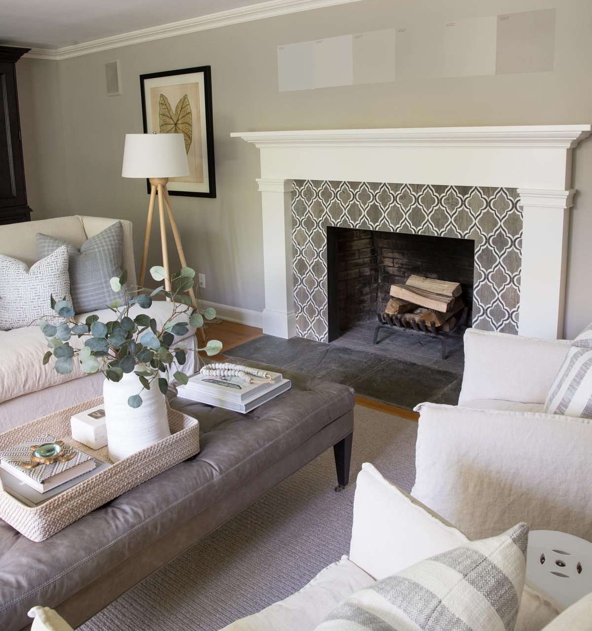
and then move them to a dark wall to see how they look in both areas of the room.
Let’s get going with comparing all six of these paint colors to Anew Gray…
Amazing Gray vs. Anew Gray
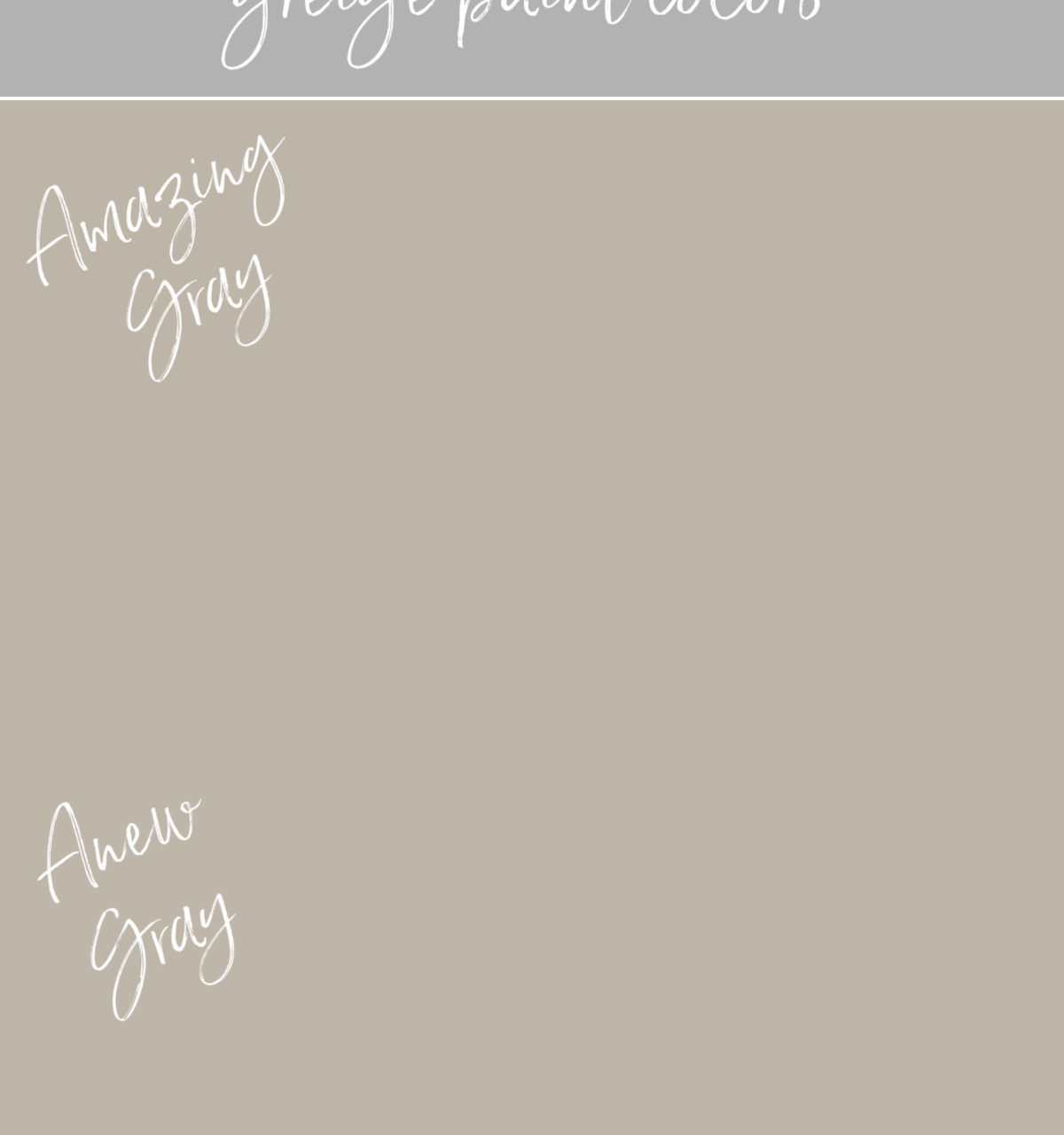
Sherwin Williams Amazing Gray (SW 7044) is SUPER similar to Anew Gray – it’s pretty hard to tell where one color starts and the other starts in my comparison of the two. They both have an LRV of 47 but Amazing Gray has just a few drops more black so is ever so slightly darker. Amazing Gray also has a touch more green than Anew Gray. You can find a Samplize sample of Amazing Gray {here}.
Versatile Gray vs. Anew Gray

Sherwin Williams Versatile Gray (SW 6072) is another color that’s very similar to Anew Gray but just a touch lighter with an LRV of 48. Versatile Gray has a little more red in it than Amazing Gray and Anew Gray. You can get a Samplize sample of Versatile Gray {here}.
Anew Gray vs. Agreeable Gray
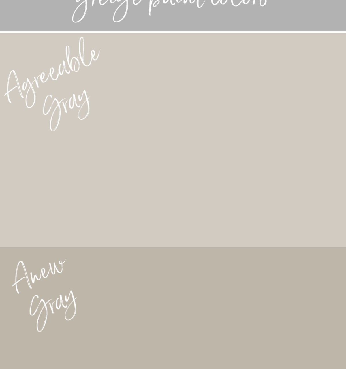
Sherwin Williams Agreeable Gray (SW 7029) lies right next to Anew Gray on the color strip. They are very similar tones but Agreeable Gray is quite a bit lighter with an LRV of 60. It’s a great choice if you love the color of Anew Gray but want something a little lighter and brighter. You can get a Samplize sample of Agreeable Gray {here}.
Anew Gray vs. Revere Pewter
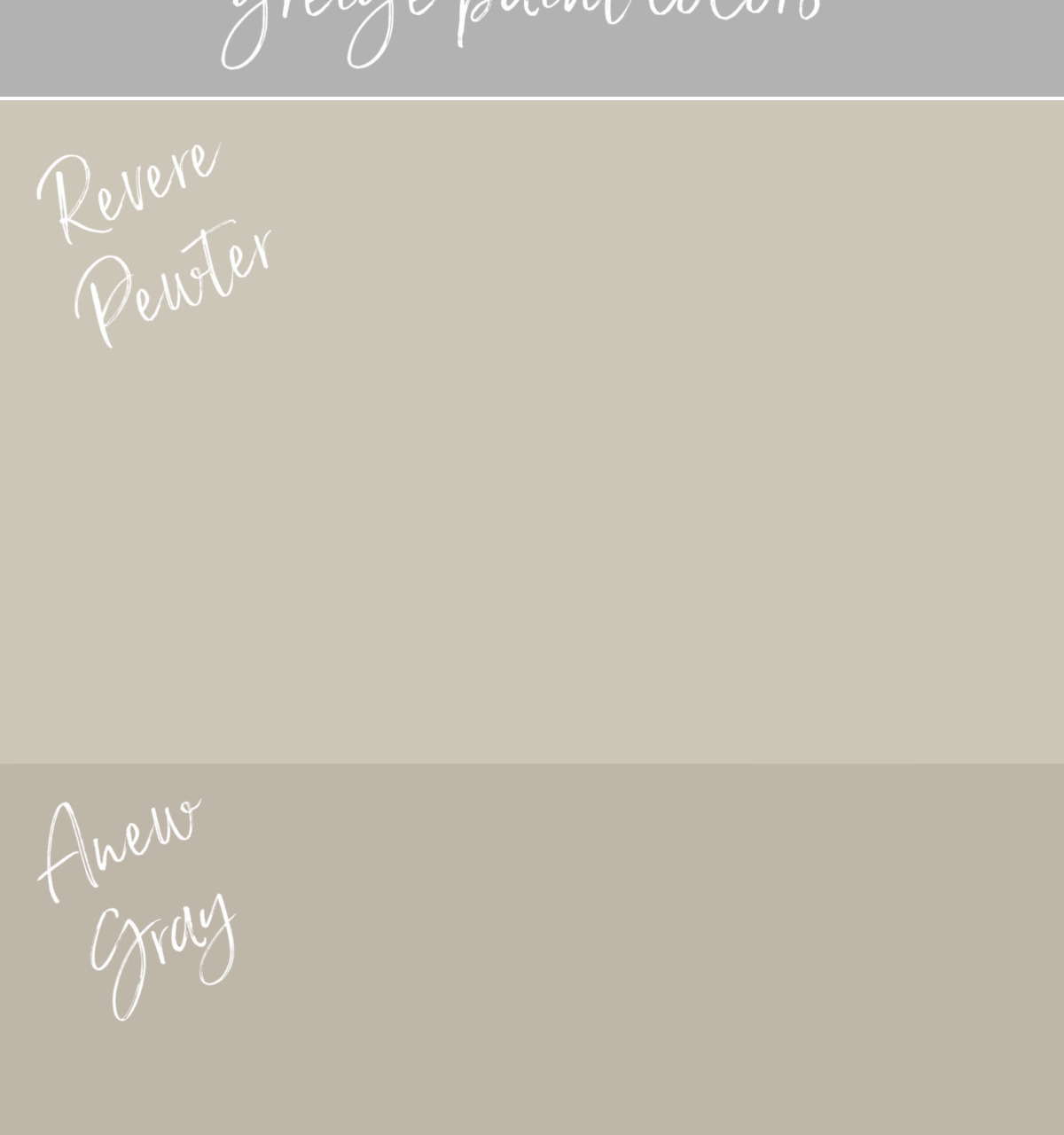
Revere Pewter (HC-172) is a Benjamin Moore paint color that’s been one of my go-to greiges for years. In comparing Revere Pewter to Anew Gray, it’s quite a bit lighter than Anew Gray and has more yellow in it. You can find a Samplize sample of Revere Pewter {here}.
I have a quick little story about Revere Pewter… Years back my sister called me in a panic because her painter had done the first coat of the color she chose for her family room and she hated it. She needed to decide on a new color asap so she could buy the paint and have it ready for the painter the next morning. She lives several states away so I couldn’t see her space in person but I took my best guess based on what she was looking for and recommended Revere Pewter which is a close to a “no fail” greige as it gets. She loved it!
Mega Greige vs. Anew Gray
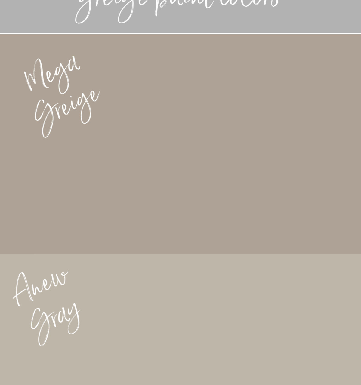
Sherwin Williams Mega Greige (SW 7031) is actually QUITE different from Anew Gray so I was surprised to find that people often find themselves choosing between these two colors. Mega Greige is the darkest of the colors I’m comparing with an LRV of 37. If actually falls between the color I previously had on our living room walls (Keystone Gray) and Anew Gray on the color strip. Just as I found with Keystone Gray, Mega Greige would be a good choice if you’re looking for a paint color with a deep rich feel but it might feel a little too dark in a room without a lot of natural light. You can find a Samplize sample of Mega Greige {here}.
Repose Gray vs. Anew Gray
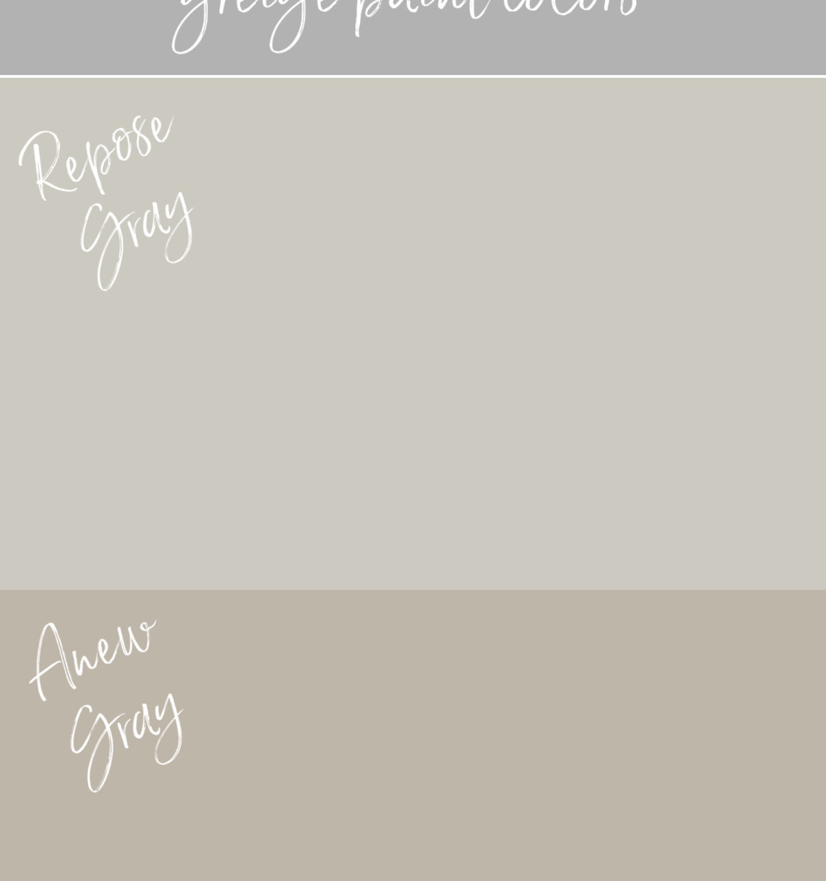
Last but not least is Sherwin Williams Repose Gray (SW 7015). It has an LRV of 58 which makes it similar to Revere Pewter in how light it is but it’s a cooler gray (has less warmth in it) than both Revere Pewter and Anew Gray. Repose Gray might look a bit stark in a north facing room but could be a good choice in other spaces if you’re looking for a greige that leans more gray than beige. You can find a Samplize sample of Repose Gray {here}.
I hope you all enjoyed today’s post! Want to see more beautiful greige paint color options? Check out my post on the best griege paint colors according to my survey of hundreds of you!
XO,



Char Read says
Could you please tell me where you found the tile that surrounds your fireplace? It is gorgeous!
Denise Warren says
I getting ready to paint my living room in anew gray . My question is I have a sofa that is denim with specks of beige in it . Also my other 2 chairs are off white with navy blue and some lighter blues . Would anew gray look good on the walls ? Also my kitchen which is facing living room ( open space ) is a beige color almost like a hint of light yellow . Would the beige kitchen wall go with the gray walls ? My kitchen cabinets are stained with countertops in beige with specks of gold and some grays . Please advice . Thanks , Denise
Sue says
Hi! I want to paint my bathroom one shade darker than the anew gray I plan to paint most of the rest of my house.Do you have a color suggestion?
Kristin Philipps says
hello! i just painted most of my house agreeable grey. beautiful color but TOO LIGHT! do u think anew grey would make a big difference? i really want a darker color!
Anonymous says
I bought 7 gallons of agreeable gray and thought it was too light against sw alabaster. I decided to switch to anew gray and it looks so good especially with sw alabaster trim and ceiling.
Amy says
What color is your ceiling? Thanks!
Pam Daniel says
Hi, love anew gray in your space! Can you share the source for your rug?
Karen B. says
Kris,
I had forgotten how the living room looked ‘before’. You have such an eye for style and color. I imagine your home will sell quickly since you’ve done such a wonderful job. Great information on paint. I’ve always stuck with matte or flat. Eggshell seems to have too much shine for me.
Karen
Shaoron Murray says
Revere Pewter was touted to be as close as one could get with NO undertones…I tried it in our bathroom ..tested…and it was absolutely purple. There are so many variables..like green trees outside the window etc. I painted a northeast bedroom gray cashmere BM…my sister loved it, soft blue gray..she tried it in her bathroom. It looked turquoise! So many variables!
Patricia says
Thank you for the paint color tutoring. I agree with and have found the same level of detail in my own decorating. Nice to be validated…and love the idea of the large re-positionable paint samples. Good luck with your move. I’ll be particularly interested because we are looking for a move, or at least a new “winter” residence. We are in NH and will most likely sell our Phoenix home soon. The children have all moved away and the distance between NH and AZ is just too much for us to handle any longer.
Nanci says
Very nice looking. I want to ask where you found a source for that window seat cushion. It’s what I’ve been looking for!
Janie Blair says
Your living room is beautiful. I recently decorated my living room with Benjamin Moore’s Pale Oak and was extremely happy with the outcome, I used Benjamin Moore’s Revere Pewter in my study and it worked really well with the transitional furniture I have in there.
Kris Jarrett says
Thank you! I used Pale Oak in a bathroom years ago and I agree – it’s a beautiful color!
Donna Fancher says
You have a dresser that is white with wood drawers pictured. Can you share where that is from?
Thanks!
donna
Debra says
Stunning room! I’d love to know the source of the console or dresser that holds your coffeemaker. Thank you!
Lisa says
Thanks for sharing a tour of your living room. I love Duration Home paint in the matte finish. It holds up very well in high traffic areas. The dresser is very pretty. Can you share the source?
Kris Jarrett says
I bought it from PB Teen but unfortunately it’s no longer available.
Anna Mac says
IMO paint is the most difficult aspect of decorating. Using a top flight decorator on a large addition in 2017 we were faced with three walls of windows and then the L shaped kitchen which continued around the wall to the driveway windows. The designer was oversubscribed while we were faced with a limited time window with the painter. The painter placed huge swaths of each paint color the designer had chosen on each wall. Every color looked different on each wall, and I didn’t like any of them. The painter told me to dilute the base coat tint to 60% (I have no idea what he meant) which is what we did. The walls actually disappeared visually. I mean, the paint color disappeared from the design equation if that makes any sense. I was somewhat irked with the designer leaving me to make this decision but it all worked out, and I’d hire her back in a new york second (you should see my kitchen).
Kris Jarrett says
I totally agree – paint colors are HARD because they really can look so different from room to room and even on different walls in the same room! Glad yours worked out in the end!
siesta says
I used revere pewter in our kitchen, as advised by a decorator. Have regretted it ever since because of the strong green undertones. Your new space looks absolutely wonderful, thanks for sharing!
Kris Jarrett says
Revere Pewter can definitely have some green undertones – usually they’re pretty subtle but in some spaces you can see them more! It’s always so disappointing to get a paint color you don’t love – the greiges can be tricky!
Susan says
Always ask which tints they use to mix your color beforehand and you will be able to discern what undertones your color will have. They have a formula they use for every color. Paint a smaller wall in the space you are redoing and live with it for a week before deciding. Usually in that space of time you will see all aspects of light from natural and artificial lighting but trust me if they use green tint in your base formula it will show no matter what your light or sunshine level is!