“What paint color is that?” is one of the most frequent question I get via emails, messages, and comments. Coming from someone who’s been known to knock on the front door of strangers’ houses to ask about their exterior paint color, I totally get it! For today’s post I’ve gathered together all of the paint colors in our previous home – good paint colors are tough to find and these are all keepers in my book! (post includes affiliate links – see my full disclosure statement {here})
Exterior Paint Color – Benjamin Moore Coventry Gray
The exterior of our home was painted in Benjamin Moore Coventry Gray (flat finish) – I can’t take any credit for choosing it since it was the color of our house when we bought it but I loved it! It’s a great midtone gray that looks a tad darker in person than it comes across in photos. One thing to keep in mind when you’re choosing a paint color for the outside of you home is that it will look lighter once it’s on the house than you’d expect from the paint chip (basically the opposite of how it works for interior paint colors).
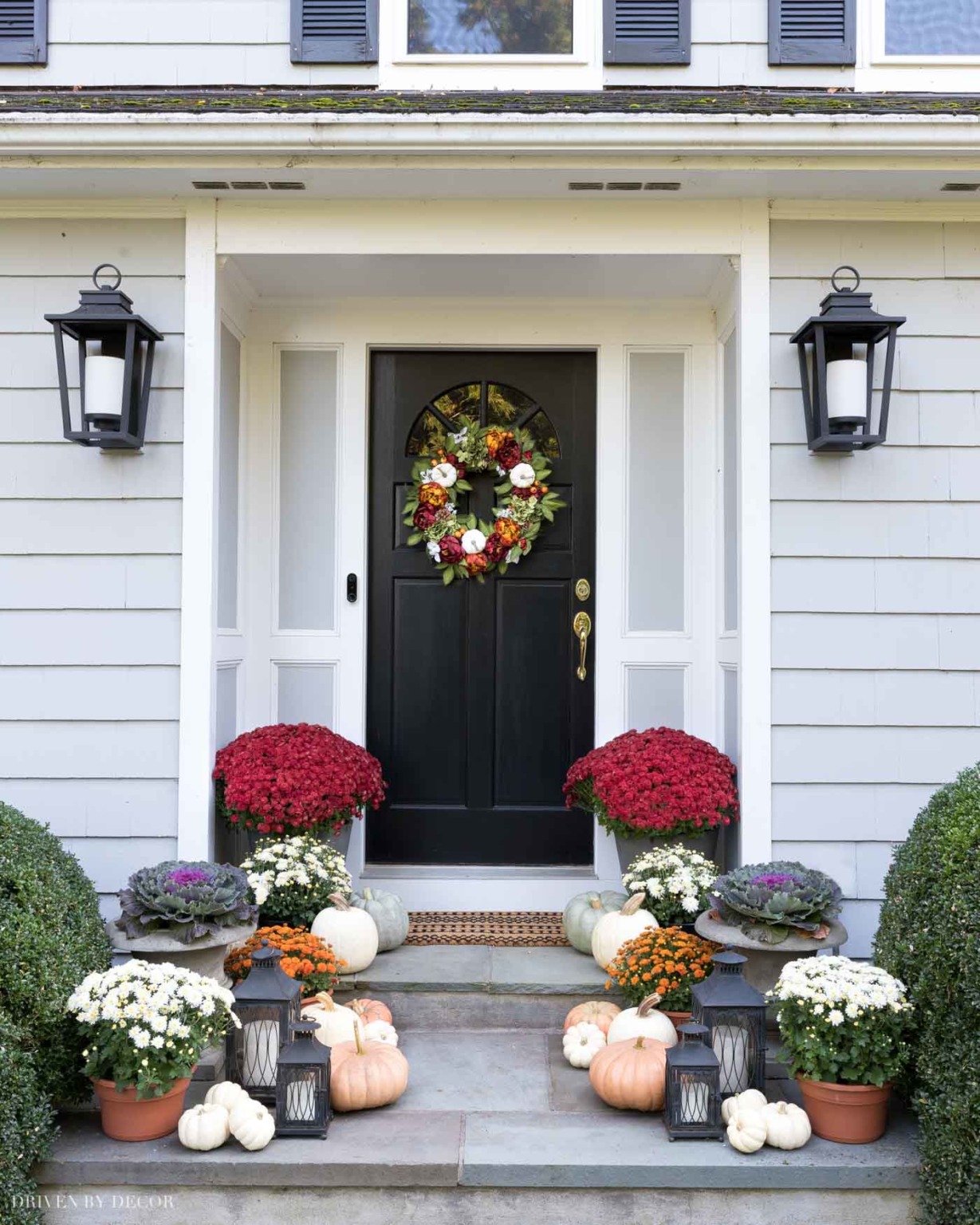
Porch Sources: Fall wreath | Doormat | Lantern sconces | Large planters (closest to door) | Urn planters | Set of black lanterns
Home Office Paint Color – Benjamin Moore Nightfall
Our home office is painted Benjamin Moore Nightfall (Regal Select Matte finish). People sometimes mistake it for navy when seeing pics of my office but it’s a dark charcoal gray/light black that I would describe as a soft black with just the slightest green undertone in certain lights. It’s a great choice if you want to paint a room black without it feeling harsh.
I have my good friend Lisa to thank for this one – I had tried five black paint samples on our office wall and didn’t like any of them when she came to the rescue with this awesome recommendation! The picture of our home office below shows what this color looks like in average light (left side), bright light (middle) and low light (right):
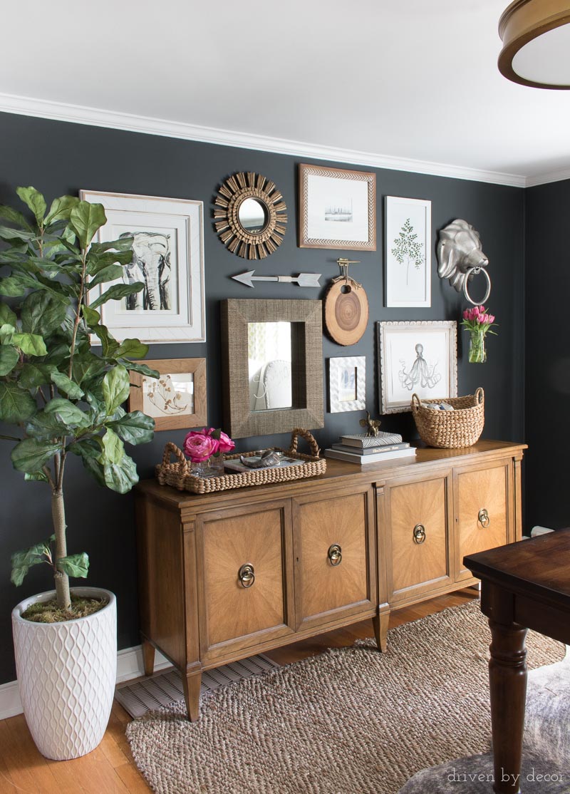
Office Sources: Faux fiddle leaf fig tree (similar) | Console is thrifted | Rug (similar) | Semi flush mount ceiling light | Elephant art print | Woven tray | Curved basket (similar) | Other sources no longer available
Dining Room Paint Color – Sherwin Williams Keystone Gray (tweaked!)
Our dining room was painted a tweaked version of Sherwin Williams Keystone Gray (Duration Home matte finish) – it’s a color that I used in my previous house and loved so much that I put it on repeat. It’s a warm, brownish gray (greige) that’s a good choice if you want something versatile (it seems to go well with everything!) and want to go darker than a lot of your typical grays. I did tweak the formula just a hair because it has some slight purple undertones that I wanted to downplay. I have the exact paint formula I used at the end of {this post}.
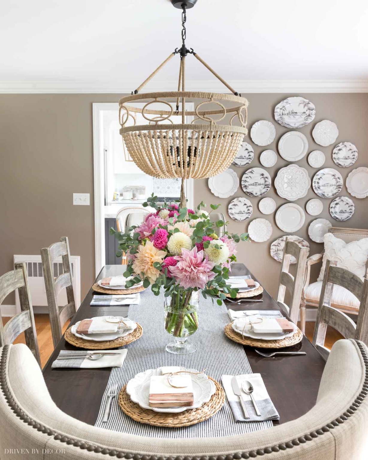
Dining Room Sources: Wood bead chandelier | Table & chairs – no longer available | Rattan chargers (similar) | Colorblock napkins | Table runner (similar) | Glass hurricane vases | White wall plates | Patterned wall plates | White chenille scalloped pillow
Living Room Paint Color – Sherwin Williams Anew Gray
Originally our living room was also painted Keystone Gray but it’s a much darker space than our living room so last year I decided to change it up and go a little lighter with the paint color. I tested out several greige paint colors (check out {this post} on readers’ favorite greiges) including these four finalists (from left to right: Worldly Gray, Anew Gray, Revere Pewter, Agreeable Gray):
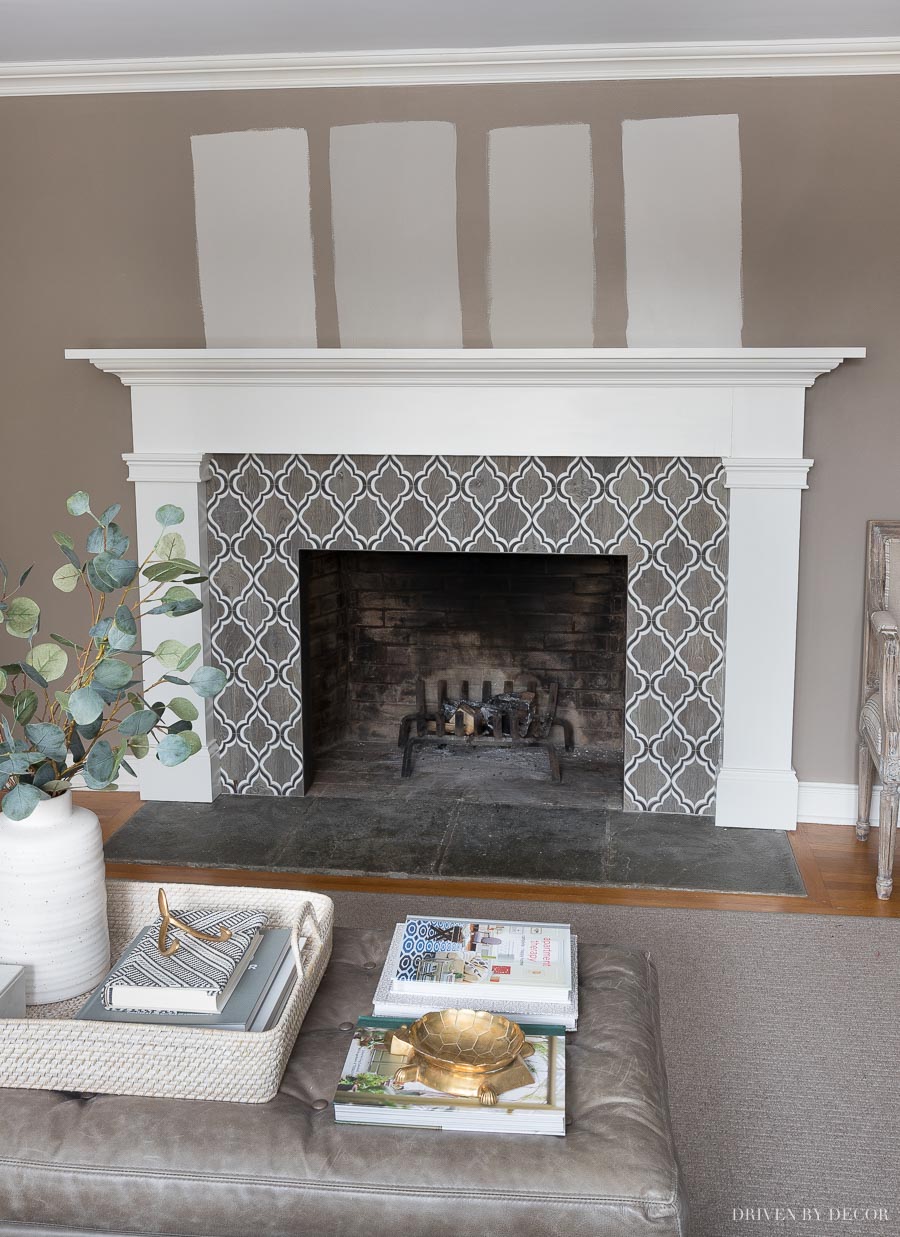
I ended up going with Sherwin Williams Anew Gray (second from the left in pic above) and love it so much!
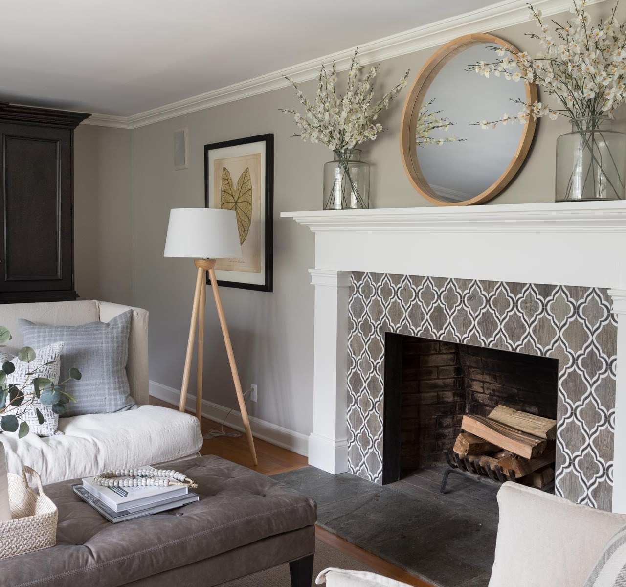
Living Room Sources: Loveseat & ottoman (custom order from Lee Industries) | Linen swivel chairs | Wood floor lamp | Framed leaf art print | Woven ottoman tray | White vase | Faux eucalyptus | Bone beads | Gray plaid pillows | Gray crosshatch pillows | Black & white striped pillows | Round mirror over fireplace | Vases on mantel – no longer available | Faux flowers in mantel vases
I wrote an entire post on Anew Gray {HERE} that compares it to similar greige paint colors and also includes all of the sources for our living room.
Girls’ Bathroom – Sherwin-Williams Alpaca
One of my favorite makeover projects was sprucing up my daughters’ bathroom that included painting the vanity as well as the walls. I chose Sherwin-Williams Alpaca (Emerald Interior Latex in Matte finish) for the walls which is another one of the greiges in my post on the 10 Best Greige Paint Colors. It’s a really pretty light-but-not-too-light greige that I would absolutely use again:
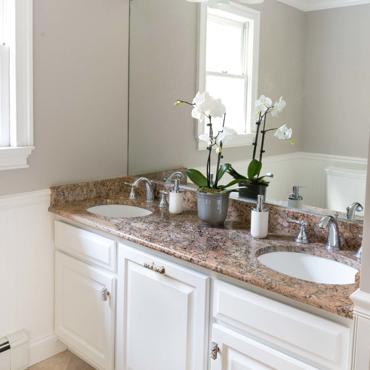
And the vanity/cabinets are painted Sherwin-Williams Alabaster which TOTALLY freshened them up from the dated, worn look they previously had. You can see the details of how I transformed our bathroom cabinets with paint in {this post}.
Kitchen Paint Color Before Remodel – Benjamin Moore White Dove
Our kitchen was originally painted Benjamin Moore White Dove (Regal Select matte finish), which is one of my favorite white paint colors (see some of my other favorite white paints in {this post})! It’s a warm white with yellow undertones – I’ve used it several times before and it definitely looks more yellow in some spaces than others depending on the light. You can see in this pic that in areas where there is a lot of light (by {these wall hanging herb crates}) it looks like a true white and in more shadowed areas (like the corner by the baker’s rack) you can see the yellow undertone:
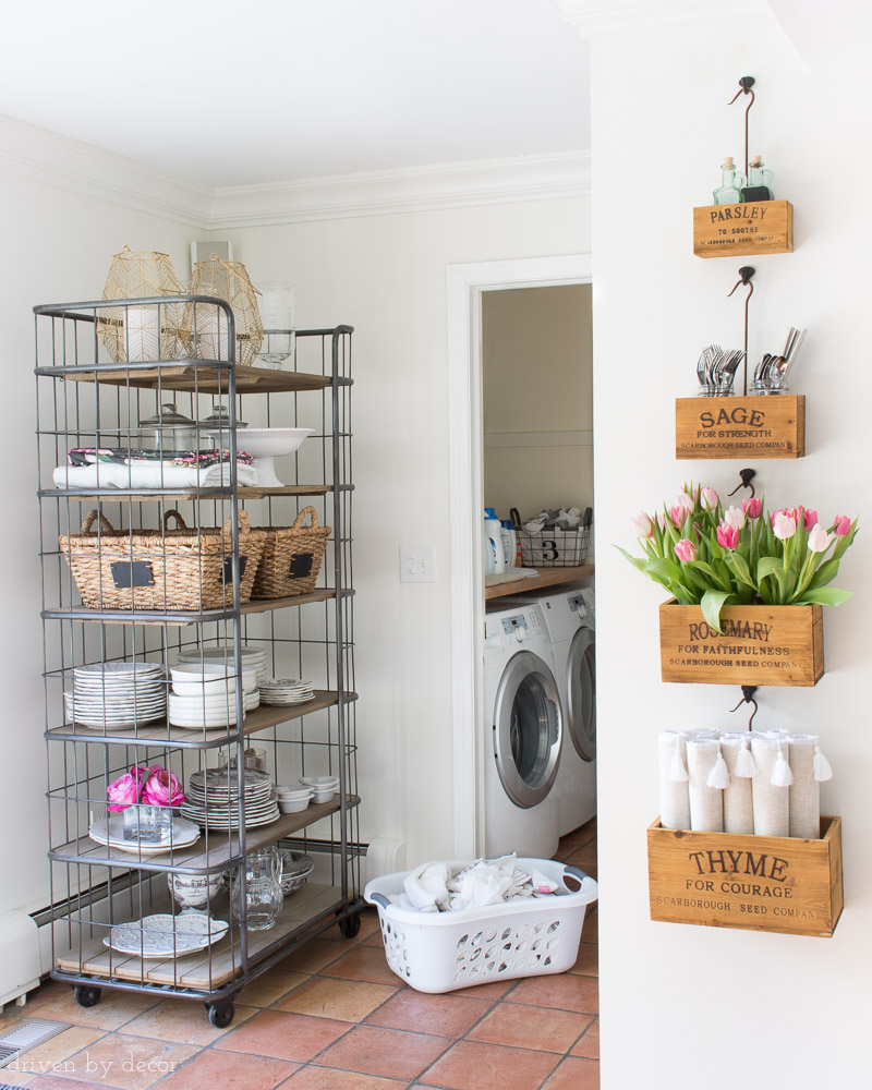
Sources: Rolling bakers rack (similar) | Nesting herb crates on wall
Kitchen Paint Color After Remodel – Benjamin Moore Cloud White
After remodeling our kitchen (you can see the “before” and “after” pics of our remodel {here} if you missed it), I changed up the white paint color a bit and went with Benjamin Moore Cloud White (Regal Select flat finish). Cloud White is fairly similar to White Dove in that it’s a warm white with slight yellow undertones but it’s a little cleaner. The trim in our kitchen is also painted in Cloud White but in Satin finish:
Kitchen Sources: Lantern pendants over island in gild size small (12.5″) | Rattan counter stools in Fog | Pulls on island drawers (12″) | Large framed floral art print | Flooring
The other room in our house that’s painted Cloud White is our family room…
Family Room – Benjamin Moore Cloud White
When deciding on a white for our family room I tested White Dove, Cloud White, and Simply White on the walls. Dove White looked too yellow in the space and Simply White looked a little too stark white for this room. Cloud White was somewhere in between – pretty much the Goldilocks of white paint colors! The ceiling and the walls are both painted Cloud White but because the ceilings are painted in satin (using BM Advance) and the walls are painted in matte (Regal Select), the ceiling color looks a good bit brighter than the walls. With white paint, I feel like sheen plays a bigger role in the look of your painted walls than it does with other colors.
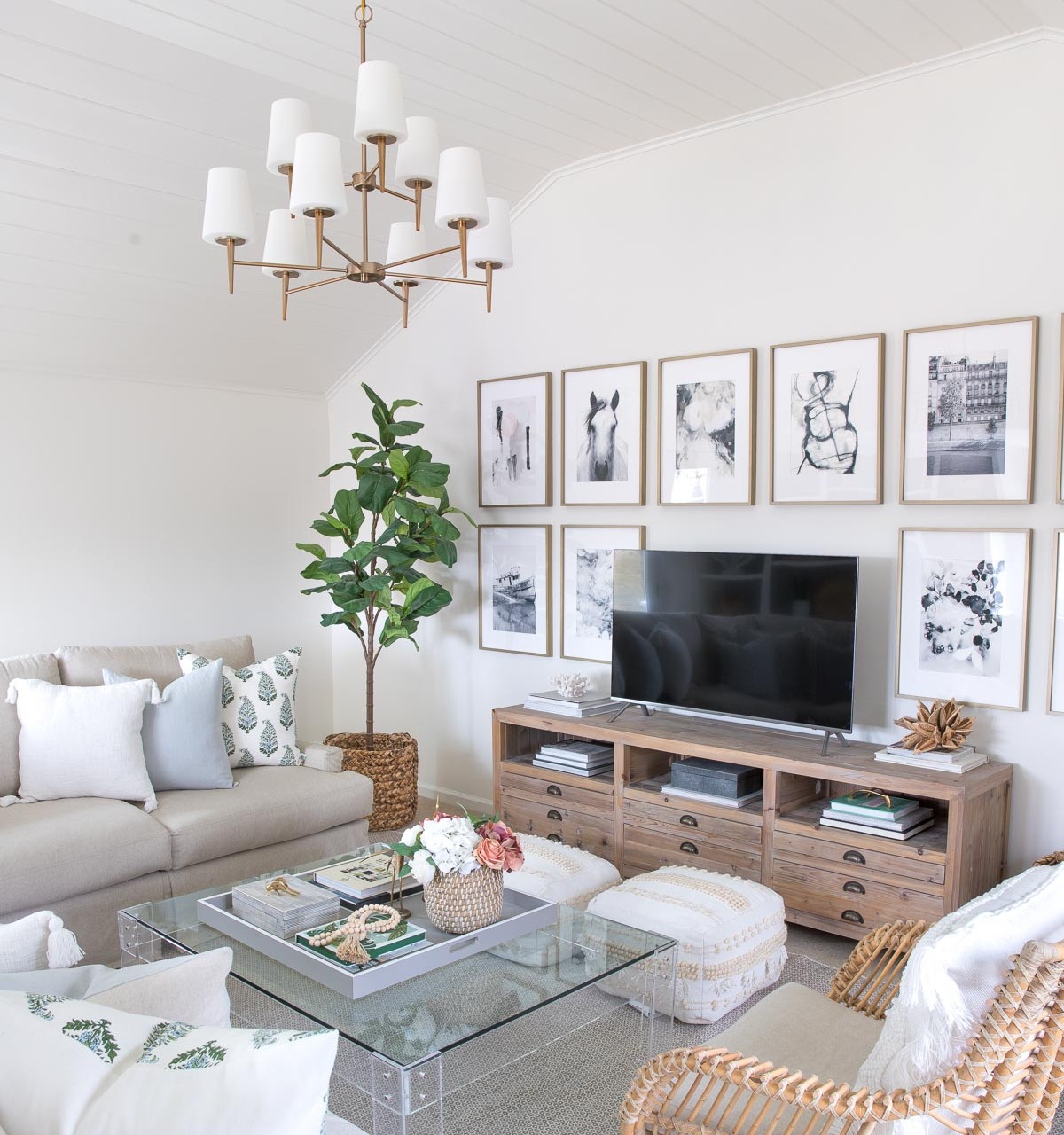
Sources: TV console (similar) | Chandelier (satin bronze) | White tasseled pillow cover | Blue linen pillow cover | Green & blue block print pillow cover | Faux fiddle leaf fig tree | Rug | Pair of floor poufs | Art prints (details in {this post} | Acrylic coffee table (similar) | Coffee table tray (28″ square) | Black and white striped box (on coffee table) | Brass cricket (on coffee table) | Wood beads | Basket planter | Rattan chair
You can see the complete “before” and “after pics of our family room {here}.
Powder Room Paint Color – Benjamin Moore Chelsea Gray & Platinum Gray
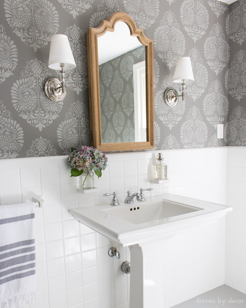
I stenciled the walls of our powder room with two shades of gray – the background color is Benjamin Moore Chelsea Gray (Aura Bath & Spa matte finish) and the stenciling was done in Benjamin Moore Platinum Gray (mixed in Behr Premium Plus Ultra satin finish). I also painted our tile floors in Platinum Gray (Floor & Patio Low Sheen Enamel). The two colors work really well together and are also great colors when used separately (Chelsea Gray is one of my go-to dark grays!).
You can get more info on my stenciled walls, including a stenciling how-to and link to the stencil used in my post on wall stencils and you can see more pics of my powder room, a full source list, and my newly painted bathroom tile floors in {this post}.
Powder Room Sources: Annapakshi Indian Damask Wall Stencil (11.25″ x 15.5″) | Arched wood mirror (similar) | Pedestal Sink | Sconces (Polished Nickel)
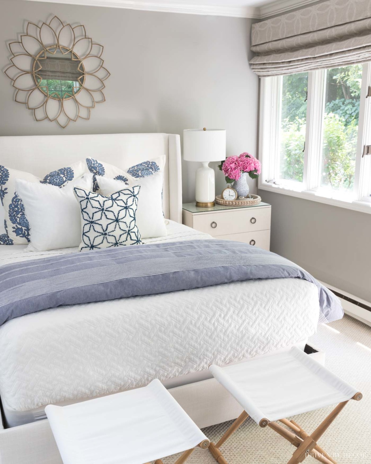
Master Bedroom – Farrow & Ball’s All White
Farrow & Ball’s All White (Estate Eggshell) is the color I used to paint the shiplap walls and trim in our master bedroom (you can see more pics of our bedroom + a full source list for the room {here}). Also check out my post on our DIY shiplap walls for all the details on our shiplap wall installation. It’s a very true white without any significant blue or yellow undertones (the bluish tint on some areas of the wall in our bedroom is the reflection of the drapes). Very bright, clean, and fresh without being stark.

Sources: Upholstered Bed | Gray nightstands | Camp stools (similar) | White USB table lamps | Semi flushmount light (available {here} and {here}) | Gray & white patterned linen duvet – no longer available | Gray & white dragon/floral pillows | Gray velvet crosshatch pillow | Quilt in king (color is Flagstone) | Drapes (mine are single-width blackout lined) | Diamond jute rug
Guest Room Paint Color – Pratt & Lambert Ever Classic
Our guest room is painted Pratt & Lambert’s Ever Classic (Accolade flat finish) – it’s a similar warm greige to our living room and dining room paint color but a bit lighter:
Guest Room Sources: Mirror over Bed | Upholstered Wingback Bed (fabric is Zuma White) | Quilt (similar) | Pillows & duvet cover – no longer available | White Bedside USB Lamps | Round Wood Beaded Tray | Clock | Folding camp stools
My Daughter’s Bedroom (Original Look) – Sherwin-Williams Lucky Green
When we made over my youngest daughter’s bedroom several years ago, she wanted to paint the walls of her room green which is basically a 180 from my usual neutrals. I was actually pretty excited about doing something so bold and after trying several green paint samples we ended up choosing Sherwin-Williams Lucky Green (Duration Home matte finish). It’s a great bright, lively green without being too obnoxiously bright.
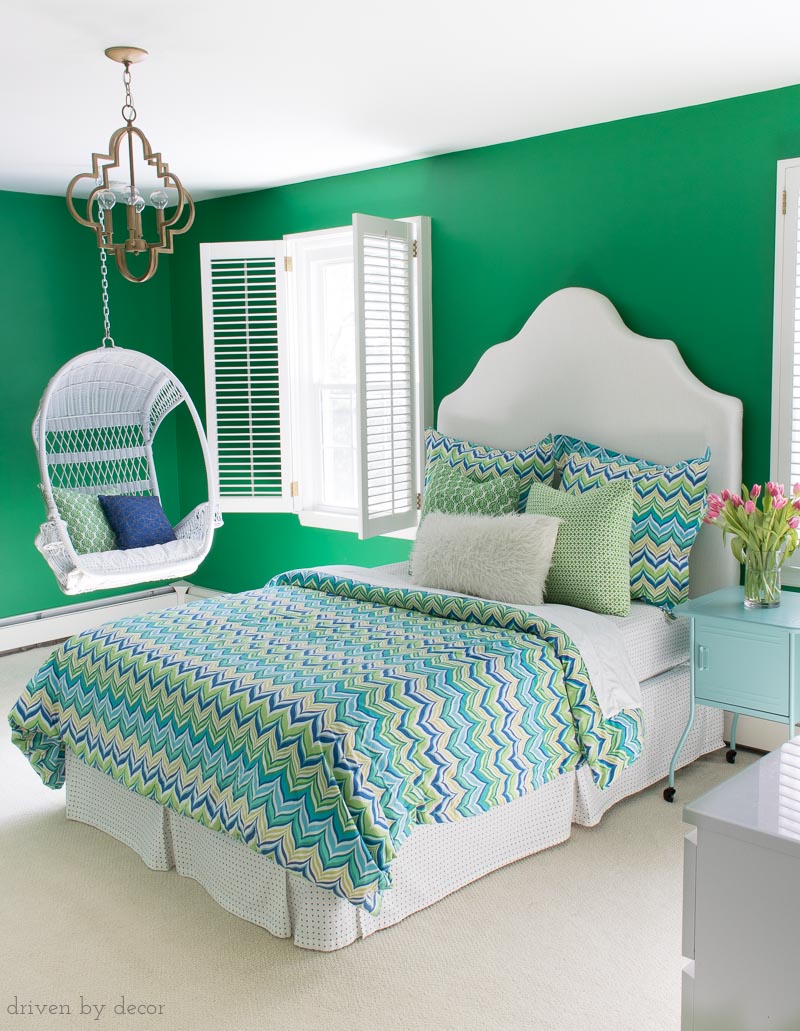
My Daughter’s Bedroom (New Look) – Behr Blueprint
Several years later she wanted to tone the color in her room down so we painted three of the walls white and used Behr’s 2019 color of the year, Blueprint, for an accent wall. It’s a beautiful blue that’s saturated but not overly bright (you can see more pics in my post on her boho bedroom colors):
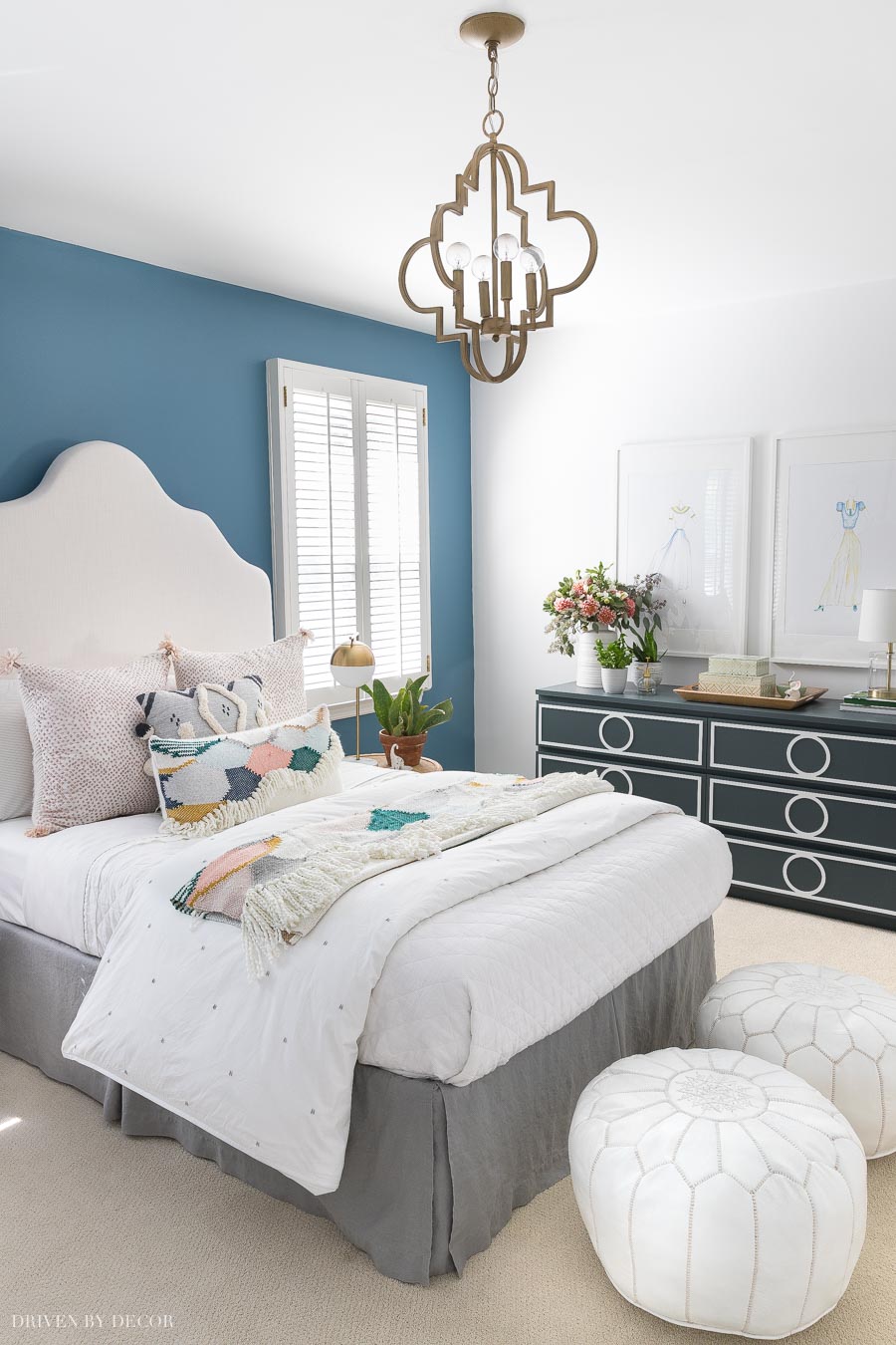
Room sources: DIY upholstered headboard | Quatrefoil pendant | White quilt | White leather poufs | Other bedding & accessories no longer available
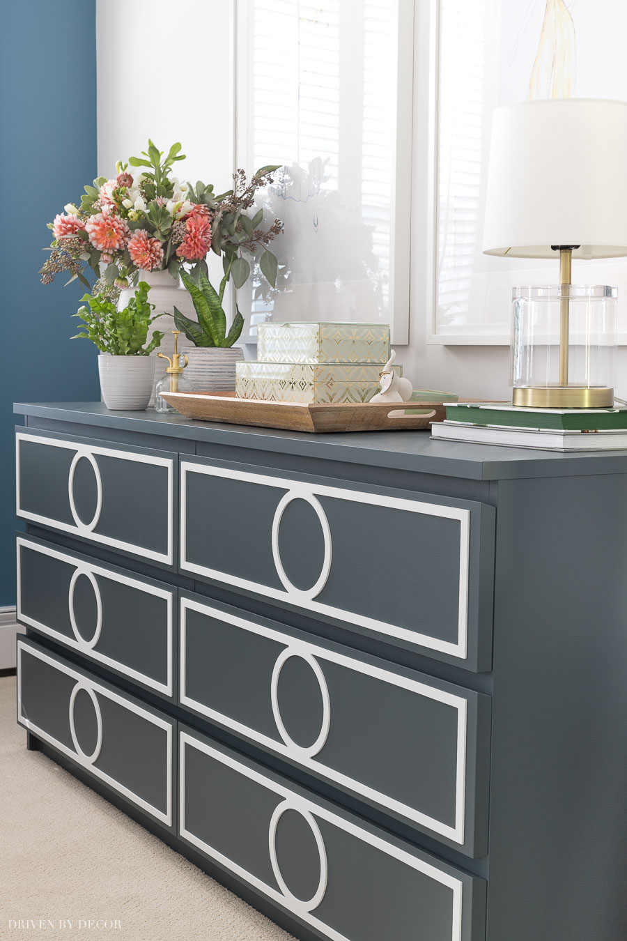
And do you see the navy dresser? That’s a white IKEA dresser that I painted and added overlays too. The paint color is Behr’s Blue Metal – it’s so pretty in person!
Master Bathroom – Benjamin Moore Chantilly Lace
The most recent paint project in our home was for our master bathroom addition – I wanted a crisp, clean white that complimented all of the marble in the space and went with Chantilly Lace. I’m so happy with it and think that from now on it’s going to be my go-to white paint color for bathrooms:
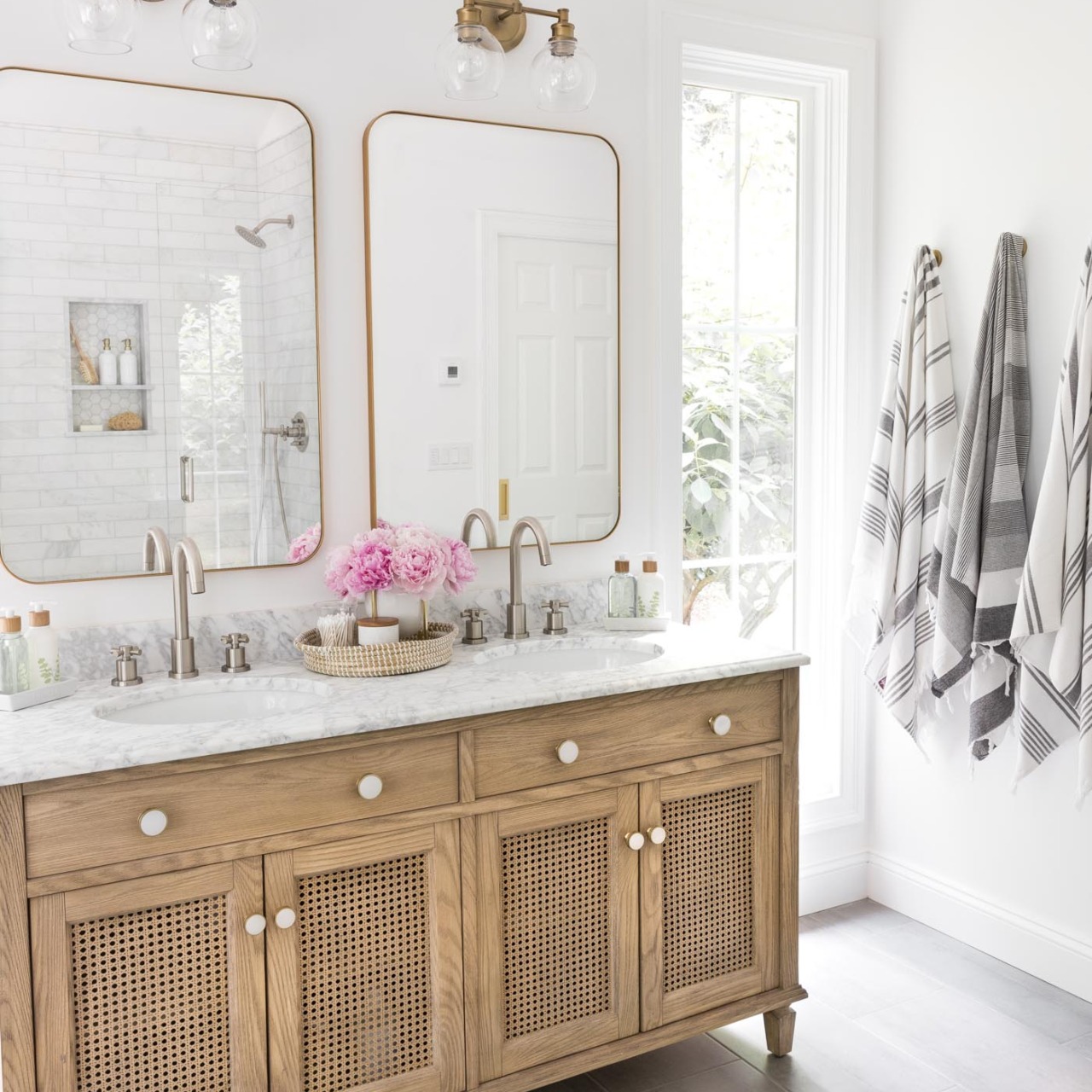
Vanity Area Sources: Wood & rattan double vanity | Vanity knobs | Bathroom faucets – brushed nickel | Vanity lights | Vanity mirrors – gold | Woven seagrass tray on vanity (similar) | Cross base planter | Marble stacking dishes | Soap & lotion sink set with tray | Toothbrush holder | Bamboo toothbrushes | Gray & white striped towels | Robe hooks – golden champagne
I wrote an entire post on Benjamin Moore Chantilly Lace, comparing it to other similar white paint colors – you can check my Chantilly Lace post {here}.
Guest Bedroom in NC – Benjamin Moore Simply White
And last but not least, I’ve painted a few rooms in our new house in NC and chose Benjamin Moore Simply White. This house gets a lot more light and after testing out three of my favorite whites in it (Simply White, Cloud White, and White Dove), Simply White was the winner:
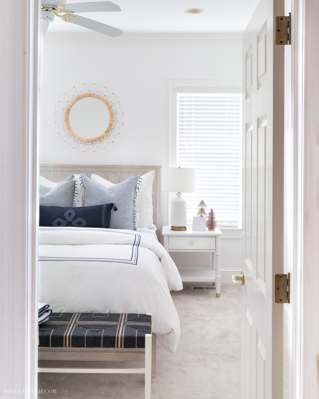
Sources: Queen beadboard bed (weathered white) | 12″ Memory foam queen mattress (no boxspring needed) | Blue & white quilted shams | Blue tasseled edge pillow covers | Navy embroidered lumbar pillow cover ( with {this} pillow insert) | Navy border duvet cover | Navy border sheets | White quilt | Backless bench at foot of bed | Nightstand | USB Lamp | Round mirror
It just goes to show how whites can look so different from home to home because when I tested those same three colors in our current home, I liked Cloud White the best! You can see more pics of our NC guest room {here}.
And with that… we’ve made it through each and every room! I hope you’ve found a paint color or two that might work in your own home. Thanks for stopping by and enjoy the rest of your weekend!


Painting Contractor says
This is great advice! Very honest and practical. Everything is special and unique. Thanks for sharing.
Missy says
Hi! What is the paint color on the kitchen island? It’s a beautiful gray/brown. Thanks!
Lauren says
I would love to know answer to this too!!
Pamela Riordan says
Hi! What paint color in Benjamin Moore is your front door? What do you think of the idea of using a gloss sheen on a front door? Thanks!
Trish says
Love your style! Where did you get the blue white throw pillow and blanket that are in your quest room?
Kris Jarrett says
Thanks Trish – those are both from The Company Store but unfortunately I don’t think they carry them anymore…
Betsy says
Your bathroom tiles look great painted, l have the same tiles in my kitchen that you have in your laundry area, tera cotta look, do you recommend painting them?
Kris Jarrett says
I’ve never tried painting terracotta tile but I would think the same painting method that I used on my bathroom floor would work!
Patricia says
This is the best descriptive article about paint choices I have ever read. Kudos to you or whomever photographed your rooms for getting great angles to display the nuances of how each color is affected by light. Thank you so much.
Terri Miles says
Hi Kris! I just found your blog today and love your home! I am renovating my home and am torn between Dove White and Cloud white! They are both perfect in my home. Question. I would like one trim and ceiling color throughout my home, that I can keep even if I change my wall color. I am thinking about BM Super White. Would this color work with Dove White and Cloud White? And most any other color I choose? And, would it work if I painted the bedrooms clould white and living spaces Dove White? Thank you very much!!!
Julie says
Hi what color trim did you use for your exterior?
Wendy Chin says
Do you have a blog post of how you refinished the white IKEA dresser? I love it! I’m wondering where you bought your overlays and/or how’d you make them.
Kris Jarrett says
Yes, you can find more details about it in this post: https://www.drivenbydecor.com/boho-chic-bedroom-design-ideas/