

Searching for the best white paint colors? Instead of going to Benjamin Moore or Sherwin Williams and blankly staring at the hundreds of white paint chips, skip straight to these 8 tried and true favorites and I guarantee you’ll find one that will look fantastic in your space!
Picking the perfect white paint color for your space isn’t always easy (make sure to read my post on how to choose paint colors for tips!). Unlike other colors where the true color is pretty obvious from looking at the paint chip, whites have lots of undertones and subtle nuances that can make two colors that look similar on a paint chip look totally different once they’re painted on the wall.
Wading through the endless number of white paint options to find a good fit can get pretty overwhelming so I’m sharing my eight tried & true white paint colors. These are the paint colors that I LOVE and that decorators and homeowners rave about time and time again. (post includes affiliate links – full disclosure statement available {here})
I’m sharing these favorite whites in order from darkest to lightest based on each paint color’s LRV (Light Reflectance Value) which indicates how much light the paint color reflects. Paints with a lower LRV will appear darker than paints with a higher LRV.
1. Behr’s White (52) LRV 83
Behr’s White 52 is a soft white that’s the closest of any of my favorite whites to being an off-white since it has the lowest LRV. It’s a slightly cool white which pairs well with blues, including the accent wall of Behr Blueprint in my daughter’s bedroom:
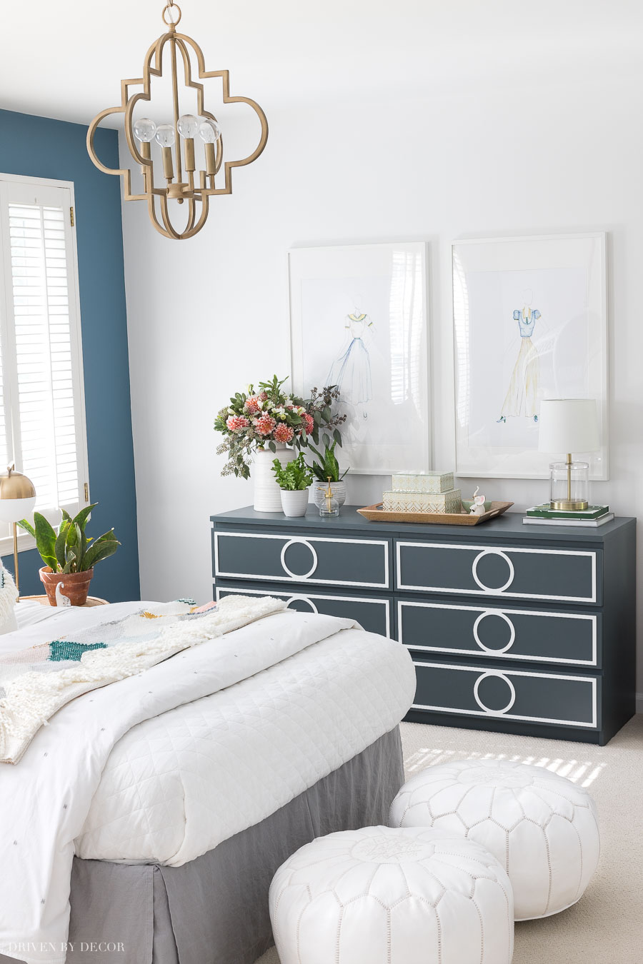
You can see more pics and all sources for this space in my post on her boho bedroom colors.
Room Sources: Gold quatrefoil pendant | Moroccan leather poufs | Small acrylic lamp | Chest of drawers | White linen quilt
2. Sherwin Williams’ Alabaster (SW7008) LRV 82
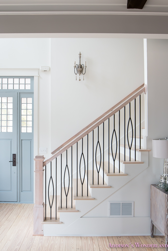
Sherwin Williams’ Alabaster, which Brittany of Addison’s Wonderland used in several rooms of her amazing historic home, is similar in depth to Behr’s White 52 but it’s a warm white rather than a cool one. In addition to the stairway below, you can see Alabaster in action in Brittany’s mudroom, hallway, master bathroom and more in her house tour {here}.

3. Benjamin Moore’s Decorator’s White (CC-20, OC-149) LRV 82.68
Decorator’s White has a touch of gray that softens it and makes it a great choice for cabinets and trim. A beautiful example is Bree of ZDesign at Home’s kitchen (her cabinets and trim are Decorators White) – you can see more of this fabulous space {here}.
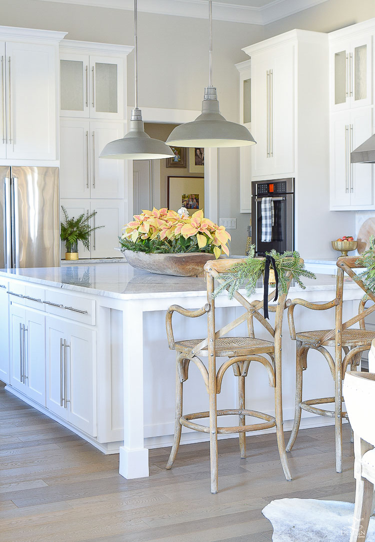
It’s close to being a pure white but with a touch of coolness and a softness that you don’t get with the brighter whites. Decorator’s White can also be a great choice for a wall paint color if you want a fairly pure white that’s not too stark.

Tip: Learning how to paint yourself instead of hiring out can save tons of money! Get my step by step in my post on how to paint a room
4. Benjamin Moore White Dove (OC-17) LRV 83.16
White Dove is a beautiful warm white that we had in our kitchen (pictured below) before we remodeled it. It’s not only a great color for walls, but also a favorite for molding and cabinets. It has warm, yellow undertones with a touch of gray that make it a soft white that’s warm and welcoming.
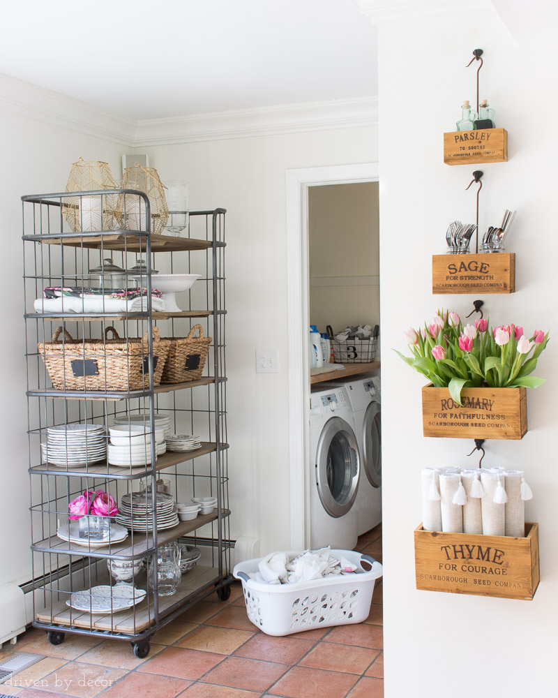
Sources: Rolling baker’s rack (similar) | Hanging herb boxes

5. Benjamin Moore Cloud White (OC-130) LRV 85.05
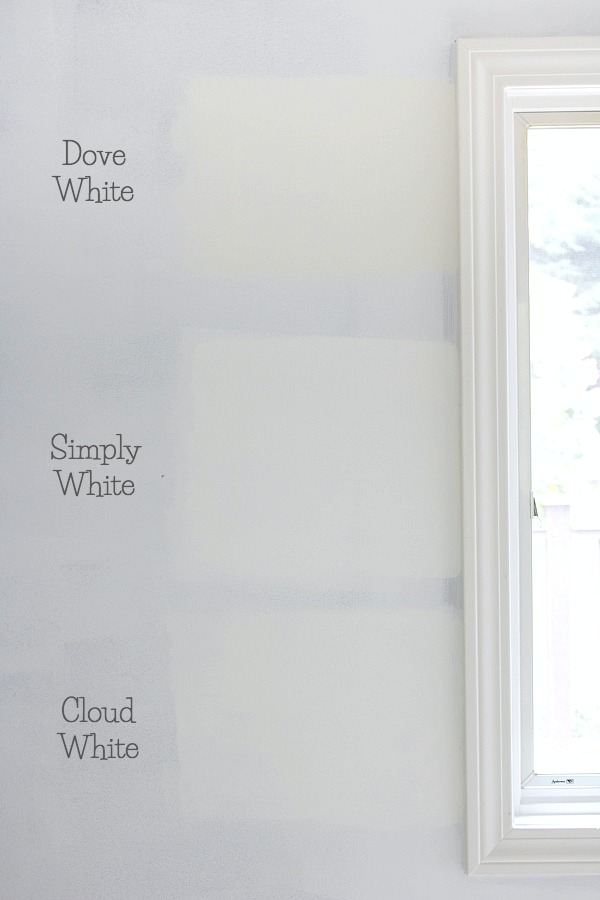
Benjamin Moore’s Cloud White is somewhere between White Dove and Simply White (the next white on my list) in how bright of a white it is. This is what the three samples looked like when I tested them out in our family room before deciding that Cloud White was the winner for this space:
I used Cloud White throughout our family room – on the planked ceiling, the walls, and the trim (matte on the walls & satin on the ceiling and trim). It was the perfect neutral backdrop for the large art wall around our TV. You can see more pics of this space and a complete source list for it {here}.
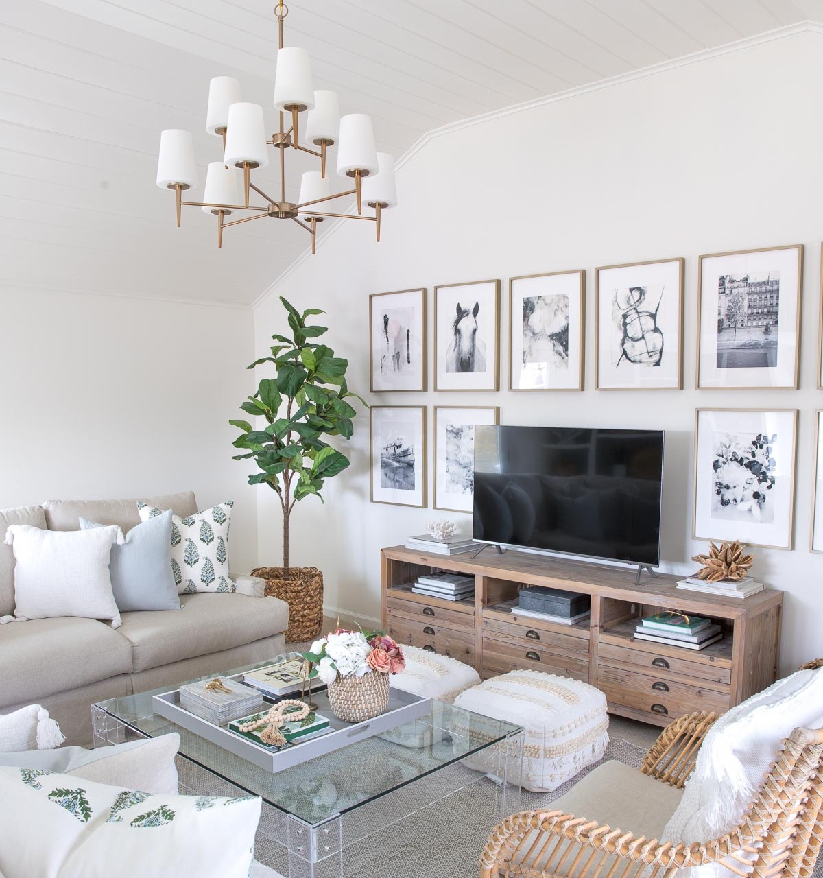
Sources: TV console (similar) | Chandelier (satin bronze) | White tasseled pillow cover | Blue linen pillow cover | Green & blue block print pillow cover | Faux fiddle leaf fig tree | Rug | Pair of floor poufs | Art prints (details in {this post} | Acrylic coffee table (similar) | Coffee table tray (28″ square) | Black and white striped box (on coffee table) | Brass cricket (on coffee table) | Wood beads | Rattan chair
I also used Cloud White in our kitchen when we remodeled (I switched from White Dove because our new cabinets were a whiter white than before so it was a better fit) – you can see more pics plus all sources in my post on my kitchen remodel.
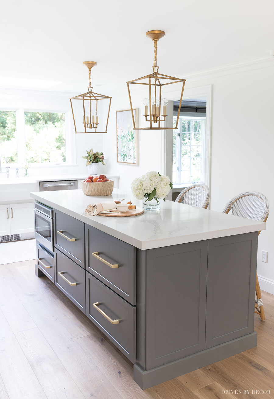
Sources: Lantern pendants over island (12.5″) | Rattan counter stools in Fog | Pulls on island drawers (12″) | Large framed floral art print
Also take a look at my kitchen eat-in area where you can get another peek at Cloud White on the walls. Want more details on this great white paint color? Check out my Benjamin Moore Cloud White review that shows a side by side comparison of how this white compares to other popular white paint colors.

6. Benjamin Moore’s Simply White (OC-117) LRV 89.52
Simply White is possibly the most versatile of all whites. Like White Dove, it has a warm undertone but it’s a bit lighter and brighter. It’s the color that I chose to paint most of our NC home including our guest room:
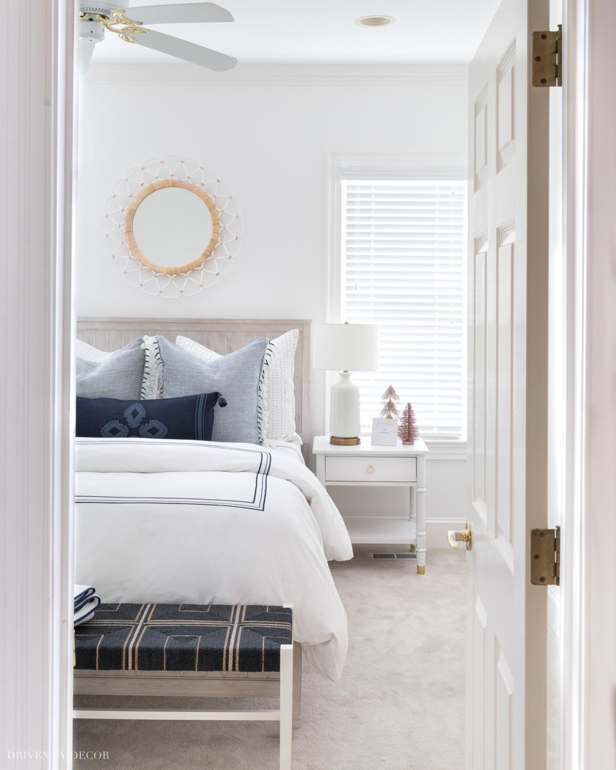
Sources: Beadboard bed (weathered white) | 12″ Memory foam queen mattress (no boxspring needed) | Blue & white quilted shams (similar) | Blue tasseled edge pillow covers | Navy embroidered lumbar pillow cover ( with {this} pillow insert) | Navy border duvet cover | White quilt | Woven bench | Nightstand (similar) | Lamp (similar) | Round mirror
For more pics, see my posts on this blue and white bedroom and our small breakfast nook that are both painted Simply White.

7. Benjamin Moore’s Chantilly Lace (OC-65) LRV 90.04
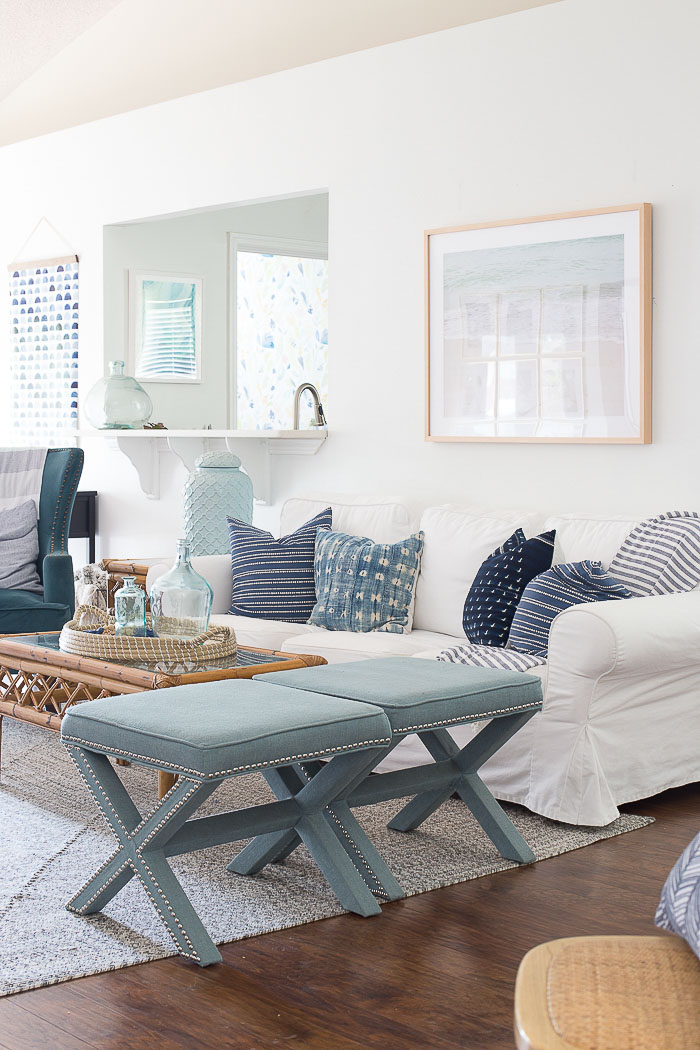
Chantilly Lace is a beautiful crisp, clean, bright white paint color that reads as a true white with a touch of blue. It’s a great choice for contemporary spaces but can also look good in more traditional homes such as this light and bright living room by Chelsea of Making Home Base that you can see more of {here}.
When I designed our master bathroom remodel, I knew that I wanted white walls since they’re the perfect neutral backdrop. I ended up choosing Chantilly Lace which was the just-right crisp white for the space:
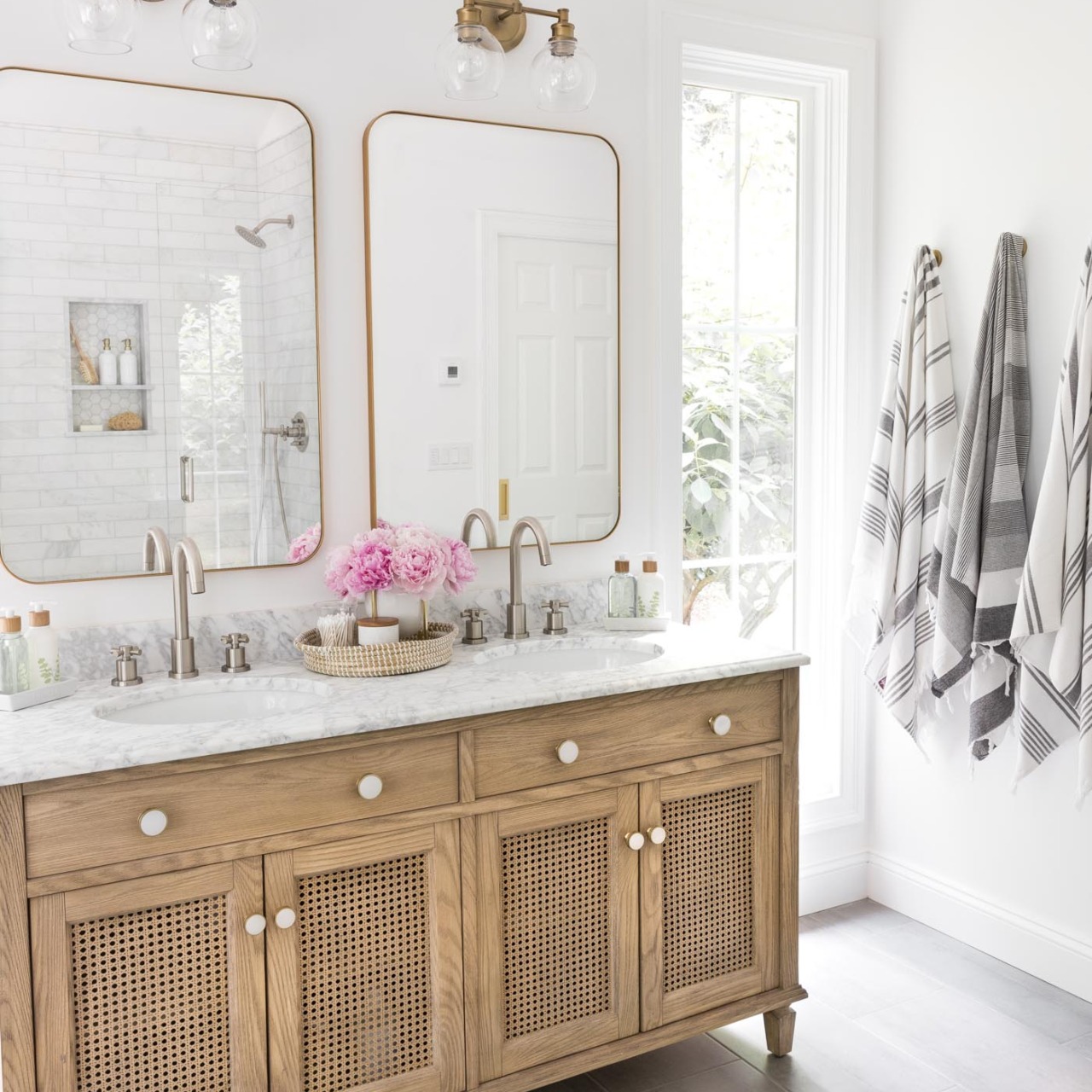
Sources: Wood & rattan double vanity | Vanity knobs | Bathroom faucets – brushed nickel | Vanity lights | Vanity mirrors – gold | Marble stacking dishes | Soap & lotion sink set with tray | Toothbrush holder | Bamboo toothbrushes | Gray & white striped towels | Robe hooks – golden champagne
The color tone of it works beautifully with marble (which is also a cool toned white) so it’s a great choice for many bathrooms and kitchens. If you’re considering using Chantilly Lace, I share more details about it and how it compares to other similar whites in my post on Benjamin Moore Chantilly Lace.

8. Farrow & Ball’s All White (No. 2005) LRV 91.8
Farrow & Ball’s All White is exactly that – it contains no other pigment except for white, creating a soft yet crisp white without the colder blue undertones of a brilliant white. It’s the color that I used on the shiplap walls and trim of our master bedroom remodel that you can see more of {here}.

Sources: Upholstered bed (similar) | Gray nightstands | Camp stools (similar) | Table lamps (similar) | Semi flushmount light (available {here} and {here}) | Gray & white patterned linen duvet – no longer available | Gray & white dragon/floral pillows | Quilt in king (color is Flagstone) | Drapes (mine are single-width blackout lined) | Diamond jute rug

How To Figure Out the Best White Paint Color For Your Space
Never choose a paint color just by looking at the paint strip. You need to see what they look like in your home! The same white paint color can look totally different in one home vs. another due to the lighting conditions of the space. I highly recommend that you buy peel-and-stick samples of the white paint colors you’re considering on Samplize (I linked each color’s Samplize sample under the paint color description).
See my post on how to choose paint colors for more tips on testing paint samples.
What Color Should I Use for the Baseboards and Trim?
When painting with whites, I recommend that you paint your baseboards and trim the same white as the walls but a higher sheen. Depending on the room being painted, I used flat, matte, or eggshell on the walls and satin or semi-gloss on the trim. The higher the sheen, the brighter the paint color appears so if, for example, you use matte on the walls and satin on the trim, they will look great together since they have the same undertones. However, the satin trim will look a bit brighter so you still get the perfect amount of subtle contrast between your wall and trim colors.
Want to save this post?
What Color Should I Use for the Ceiling?
I typically recommend that you paint the ceiling with the same white paint color that you’re using on the walls (flat or matte is best since in hides roller marks and imperfections). You could also choose to use a single ceiling paint color throughout your home – my favorite is Benjamin Moore Muresco ceiling paint.
How About Color Matching?
It’s possible to have a paint color from one brand mixed by another brand (for example, asking Sherwin Williams to mix paint that’s identical to a Benjamin Moore paint color). Sometimes color matching works and sometimes it doesn’t. But with whites… just don’t do it! There is very little pigment in white paint colors so just a small change can cause a big difference in how the color appears when painted on your walls.
Now that I’ve shared my favorite white paint colors, do you want to know about some of my other favorite colors? Check out…
Also be sure to check out {this post} where I share all of the paint colors in my home! Thanks as always for stopping by!



Caralee Moore says
This post came at the perfect time!! I have been trying to find the perfect white on our our huge fireplace wall. Our walls are BM Revere Pewter and our trim is just basic white (that the previous owners had chosen). I would like it to be a soft white without being too yellowy . Any recommendations for what white would work best on that wall? Thank you for your time.
Kris Jarrett says
One you could try is Cloud White – it’s exactly that, a soft warm without without too much yellow.
Katy Beacher says
Is it my monitor or do all these whites have a touch of blue? I think I like Chantilly Lace the best. But it is really hard to tell.
Thank you.
Kris Jarrett says
It’s your monitor 🙂 Many of these are warm whites that aren’t at all blue.
Annie says
Which whites do you recommend for high altitude north facing rooms?
Kris Jarrett says
I don’t know about high altitudes but for north facing rooms, white paint colors with warm undertones work best!
Design Chic says
Wonderful information, Kris. Benjamin Moore Simply White and Dove white are my “go to” colors. Happy Valentine’s Day!
Kris Jarrett says
Love those too! Hope you got spoiled on Valentine’s Day!
Joycee says
Does White Dove work for cabinets in a small kitchen with low natural light?
Laurie says
I love Benjamin Moore colors. I used their Simply White for the trim in my house and White Dove for my kitchen cabinets. Pretty much all my walls are painted in one of their colors. Mostly neutrals, blues, or greens.
Kris Jarrett says
Laurie I’m with you – especially when it comes to whites Benjamin Moore is my go-to!
Grandy says
Wish I had read your entry a year ago. We just built our new home on the NC coast where we get lots of bright light in the upstairs rooms. I had two bedrooms painted Simply White after painting numerous board a variety of whites. As soon as the rooms were completed, before we even moved in, I knew I had made a mistake. The rooms looked a ‘greeny-yellow’. Awful! They look even worse now that my red, white, and blue themed bedding is in there. I hate to paint and my husband refuses to pay a pai ter!
Kris Jarrett says
Ugh! I have seen Simply White used time and time again and be the perfect white BUT I’ve also seen it turn green – I tried to use it in my own home and painted one wall but it definitely had a green tint in my space. It varies so much from house to house!
Angela G says
Just painted simply white and the painter thought maybe they got it wrong it looks green. He has to do one more coat so I can change. This is for all bedrooms. The rest of my home is the sw alabaster. What should I put over the simply white to not be green?
Brenda says
HI
I am having the same problem with both Cloud White and Simply White-I feel your pain!
I have a tint on my windows and grass and blue water outside which impacts I am sure, but even in a washroom with no window, the paints still look green.
Wondering if you have come up with any solutions? I just hung up from Sherwin Willliams after discussing Alabaster, which they tell me has gray instead of yellow undertones and would be similar to Cloud White.
I guess this is why the root word of paint is pain.
Would be interested to hear from you.
Thank you.
Brenda
Kris Jarrett says
Brenda one thing I found is that the Matte sheen of both paints is quite a bit different than the flat so I’ve gone back to using flat since it’s less yellow/green. Cloud White flat doesn’t give off any of the green tones in my house!
Cristi says
Flat finish on walls is a very helpful hint! I’m from the old school of using “eggshell “ on the walls but I really love your idea of using a Matte sheen -makes for a much more updated look! Thx for that!
Brenda says
Good article! I’m needing to refresh some spaces in our home that were painted white when we bought the house but remind me of ‘primer’! It just doesn’t look finished! I love white and want to keep it white but use a ‘warmer’ version of the color! I was feeling overwhelmed about how to go about it! This article comes at a good time! Thanks Kris!
Kris Jarrett says
I’m so glad that you found it helpful Brenda! XOXO
Linda says
Has anyone used BM Alabaster? Is it the same as SW’s?
Anonymous says
No I actually made that mistake by specifying the wrong brand.
Lauren says
Hi there! I’m curious after looking at this great article because you seem to know your stuff, what white (white on white for trim and cabinets) you’d suggest for a room that doesn’t get a ton of sun throughout the day. I’m saddened to discover my hubby and my first house seems to not have many, or big, windows though I would really like to punch up the light and airy factor. Creme and oat coastal or white and oat and creams is the look I’d like most (both in decor and on walls, etc). Do you have any suggestions? It’s hard to find suggestions for this look when the room isn’t a bright one! Thanks!!
Kris Jarrett says
Lauren I think several of the whites in this post might work well for you – it just depends if you’re looking for a cool white or warm white and what intensity. I’ve found that Cloud White works well in darker spaces so maybe try a sample of that first and go from there!
Cristi says
Thank you for this amazing article! It has been extremely helpful in my process of converting to more white walls in my house! In regards to your comment about Cloud White working well in darker areas, would it compliment Decorator’s White cabinets well? Based on your article and my samples, I’d like to paint my current gray cabinets Decorator’s White; however, I’m still searching for a white for the walls /trim/ceiling that won’t compete. Your thoughts are greatly appreciated! 🙂
Vicki says
for those with questions about walls vs trim colors…I just painted my home with a color called Weathered White. I used the European look with same color base and crown. What I ran into was the crown created a shadow and looked darker , so I had it lightened up quite a bit and in a semi gloss. It was right above painted cabinets which were in the wall color but semi. It was all seamless and gave a great look to a 60′ rancher with lower ceilings. I read about this European style on some decorating site. It was great solution.
Kris Jarrett says
Thanks for sharing Vicki!
Sherry says
HI Kris, I’m stuck between White Dove and Swiss Coffee. I like both but one or the other looks better on my walls in different parts of the house. What do you think about BM Swiss Coffee?
Kris Jarrett says
Unfortunately I’ve never used that color Sherry so I can’t really comment on how it compares to White Dove. Sorry!
John sanders says
What are your thoughts on Benjamin Moore line Aura vs. Regal Select and would you do trim in either of those two or Benjamin Moore Advance?
Kris Jarrett says
Hi John! I’ve painted with all three of those Benjamin Moore paints and they’re all great paints. I use Regal Select in semigloss for trim unless I’m painting over oil-based paint, in which case I use Advance. Hope that helps!
Barbara B. says
I have all oil base alkyd trim and want to switch to latex. Do you sand before using Advance? Is it worth trying to do this or should I just forget it? Thanks.
Kris Jarrett says
It’s best to lightly sand before using Advance when painting over oil but just enough to scuff the surface – there is no need to do heavy or time intensive sanding 🙂
Lynn says
we are renovating an older home Traditîonal Greek Revival. I want to use a creamy white for the interior. What’s your opinion on using one color like dove white by Benjamin Moore for the wallboards as well as the trim for moldings , mantle and other trimwork. Is using one color in this way a trend now or should I stay with two contrasting shades? Thank you
Kris Jarrett says
I actually love the look of White Dove for both the walls and trim (I have that combination in my kitchen!). Even though it’s the same color, the different sheen makes the color look slightly different so I feel like it gives some subtle contrast yet still flows together really well.
Millenia says
Maybe you could help me!? I have white/gray/light blue (looks like marble) ceramic tiles with dark grey filling in between everywhere in my apartment and was wondering which white to put on my walls. Im in a basement so i dont want for it to look to cold ???? i tried blue on my wall and I ended up not liking it at all ????
Kris Jarrett says
Hi Millenia!
Unfortunately picking the right white paint color is something that really needs to be done in person. What I would recommend is that you pick up the color strips for these white paints and bring them home to look at them in your space. Pick your three favorites and get sample cans in those colors – paint a large area (two coats!) in each of the three colors and I promise that it will be easy to tell which color is best with everything else you have in your space!
Anonymous says
Benjamin Moore – Atrium White and Mascarpone are my favorites – Atrium White neutral not too blue or yellow great for trim and ceilings. Mascarpone – warm – creamy without being yellow. Much prefer it to Linen White.
Kris @ Driven by Décor says
Thanks so much for adding to the list of beautiful whites!
riley says
If you’re looking for a crisp white, Benjamin Moore’s Mountain Peak White is a good choice.
Kris @ Driven by Décor says
Thanks for the tip Riley – I will have to check that white out!
Kim @ Savvy Southern Style says
Yes, there are so many whites. I use Chantilly Lace on our trim and I have Linen White in a guest room.
Kris @ Driven by Décor says
Linen White is a pretty one too – I should have included it on my list!